
KPI Relationships
📊 Overview
KPI Relationships define how KPIs are related to each other and help GermainUX identify signals that may explain changes in a KPI being analyzed.
Relationships are used by the Analysis Dashboard to prioritize related KPIs and provide additional context during analysis and root-cause investigation.
For example:
|
Source KPI |
Related KPI |
Relationship |
|---|---|---|
|
User Click Failure |
Mouse Click Error |
Mouse Click errors may contribute to failed user interactions. |
|
Order Sync Issue |
Salesforce API Error |
API errors may provide context for synchronization issues. |
|
Shopify Conversion Rate |
Checkout Page Load Time |
Increasing page load time may be associated with decreasing conversion. |
Relationships are directional. A relationship configured from KPI A to KPI B does not automatically create a relationship from KPI B to KPI A.
📈 How KPI Relationships Support Analysis
When a KPI is opened in the Analysis Dashboard, GermainUX evaluates its configured relationships to identify signals that may help explain the KPI's behavior.
Related KPIs can be prioritized using factors such as:
-
Deviation from baseline
-
Direction of movement
-
Relationship strength
-
Relationship type
-
Co-movement with the KPI being analyzed
This helps investigators quickly identify KPIs that:
-
May contribute to the observed issue
-
Move with the analyzed KPI
-
Move in the opposite direction
-
Provide useful contextual events
-
Execute within the analyzed KPI's activity
Instead of manually comparing multiple dashboards and KPIs, investigators can focus on the signals most relevant to the current analysis.
📚 Relationship Types
|
Type |
Meaning |
Example |
|---|---|---|
|
Contributor |
Changes or issues in the related KPI may contribute to changes in the source KPI. |
Mouse Click errors contributing to User Click failures |
|
Correlated |
The KPIs tend to move together without asserting that one causes the other. |
API latency and page response time increasing together |
|
Contextual |
The related KPI provides useful investigative context. |
A deployment event occurring around the time of an error spike |
A relationship helps prioritize an investigation; it does not, by itself, prove causation.
⚙️ Configure a KPI Relationship
The easiest way to create a relationship is through the Add KPI Relationship wizard from the source KPI's configuration.
Germain Workspace > Left Menu > Wizards > Add KPI Relationship
-
Open the KPI from which the relationship should originate. This is the source KPI.
-
Open KPI Relationships.
-
Launch the Add KPI Relationship wizard.
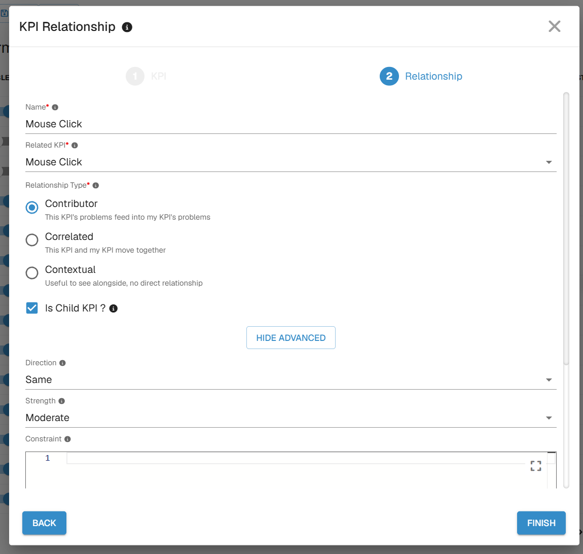
KPI Relationship Wizard - GermainUX -
Select the related KPI.
-
Configure the relationship.
-
Select Finish or Save.
-
Confirm that the relationship appears under the source KPI's KPI Relationships.
📝 Configuration
|
Field |
Required |
Description |
|---|---|---|
|
Name |
Yes |
Unique name identifying the relationship and related KPI. |
|
KPI |
Yes |
KPI related to the current source KPI. |
|
Type |
Yes |
Contributor, Correlated, or Contextual. |
|
Direction |
Yes |
Expected direction of movement: Same or Inverse. |
|
Strength |
Yes |
Expected relationship strength: Strong, Moderate, or Weak. |
|
Constraint |
No |
Filter that must be satisfied for the relationship to apply, such as |
|
Field |
No |
Field used to correlate instances of the two KPIs, such as |
|
Measure |
No |
Measure evaluated for the related KPI, such as |
|
Show As |
Yes |
Displays the related KPI as a Trend or Marker in the Analysis Dashboard. Trend is the default. |
|
Child |
No |
Indicates that the related KPI executes within the source KPI's context and supports nested activity in the Analysis Trace Timeline. |
Direction
|
Direction |
Meaning |
Example |
|---|---|---|
|
Same |
The related KPI is expected to move in the same direction as the source KPI. |
Error Clicks and failed User Clicks increase together. |
|
Inverse |
The related KPI is expected to move in the opposite direction. |
Page load time increases while conversion decreases. |
Direction describes the expected numerical relationship, not whether the behavior is good or bad.
Strength
|
Strength |
Use When |
|---|---|
|
Strong |
The relationship is consistently expected and highly relevant to investigations. |
|
Moderate |
The relationship is meaningful but may not appear in every situation. |
|
Weak |
The relationship is indirect, occasional, or exploratory. |
Strength affects prioritization in the Analysis Dashboard. Configure it based on observed behavior and domain knowledge rather than the importance of either KPI.
🧾 Example
Assume Mouse Click errors are a leading contributor to User Click failures occurring within the same user session.
Configure the relationship on the User Click KPI:
|
Field |
Value |
|---|---|
|
Name |
|
|
KPI |
|
|
Type |
|
|
Direction |
|
|
Strength |
|
|
Field |
|
|
Show As |
|
|
Child |
Enabled |
To include only Mouse Clicks associated with an error, add a constraint such as:
userError == true
🔬 Analyze Related KPIs
Configured KPI Relationships become part of the investigation in the Analysis Dashboard.
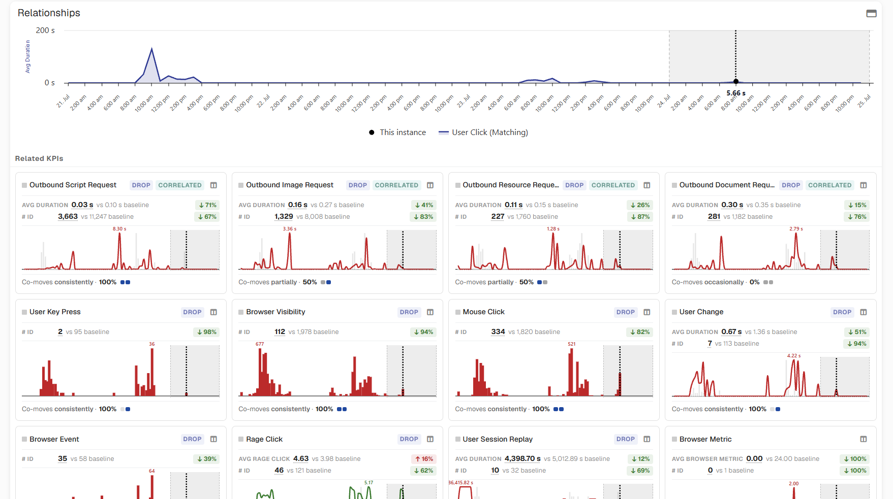
Depending on the relationship, a related KPI can be displayed as a Trend or Marker.
📈 Trend
Use Trend when changes over time, deviation from baseline, or co-movement are important to the investigation.
A related KPI can display:
-
Current value
-
Comparison with baseline
-
Trend
-
Deviation or health
-
Co-movement with the analyzed KPI
Select a related KPI's trend to add it to the main chart and compare it directly with the KPI being analyzed.
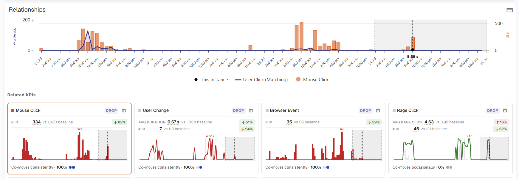
📍 Marker
Use Marker for discrete events where timing is more important than an aggregated trend.
Examples include:
-
Errors
-
Crashes
-
Deployments
-
Configuration changes
Markers are displayed on the Analysis Dashboard timeline. Select a marker to investigate the individual occurrence and compare its timing with changes in the analyzed KPI.
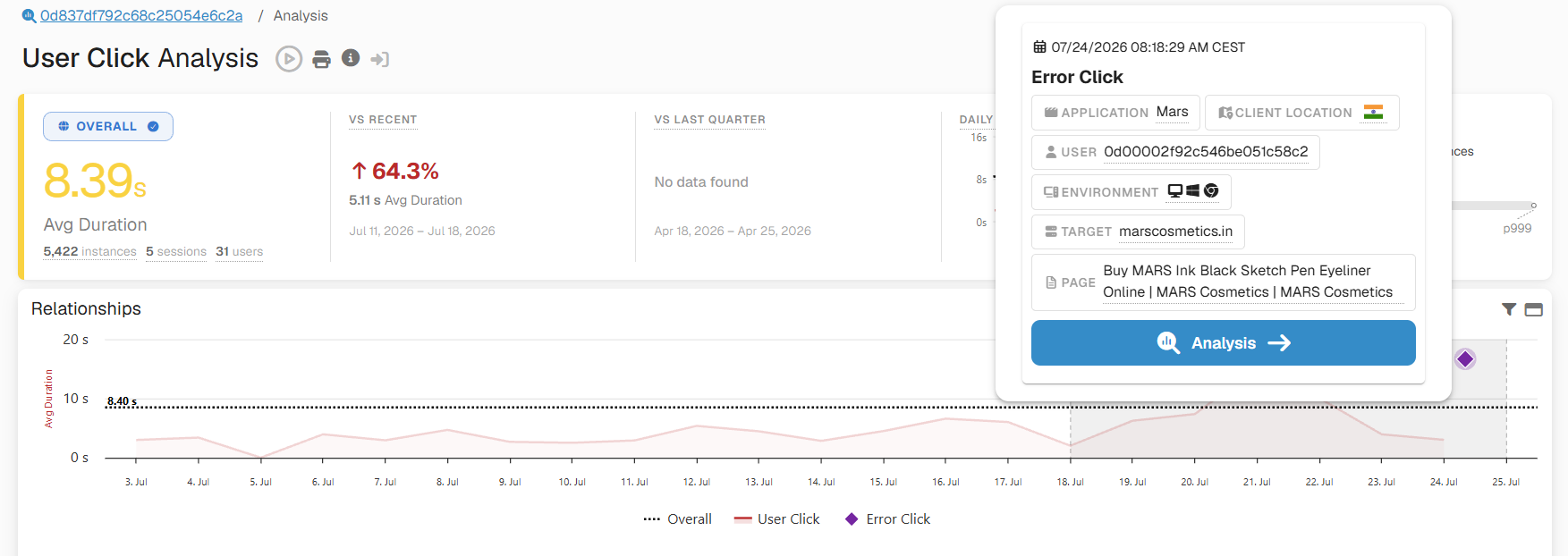
🔁 Pivot a Related KPI
A Trend relationship can be segmented using a Pivot to determine whether the relationship is concentrated within a particular population, application, technology, or environment.
-
Select Pivot By on the related KPI.
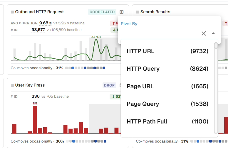
Pivot By - GermainUX -
Select a dimension such as Country, Browser, or Server.
-
Review the resulting segments.
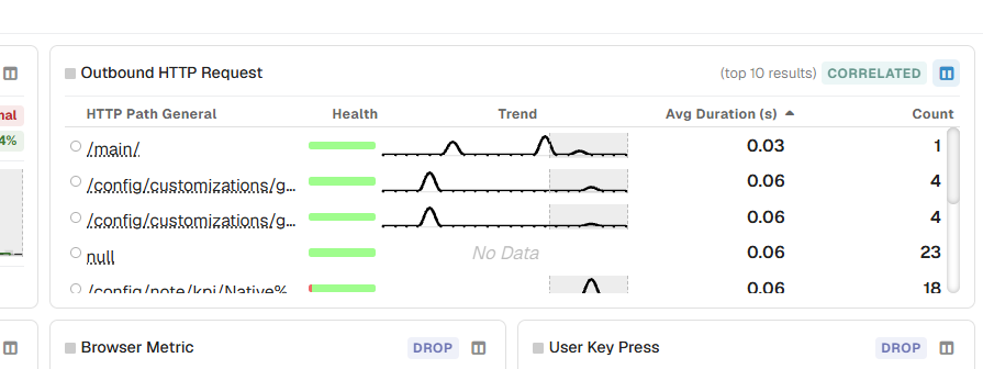
Pivot values - GermainUX -
Compare their health, measure, count, and trends.
-
Select a segment to add it to the main chart.
This can reveal, for example, that a performance issue associated with declining conversion affects only a particular browser, application version, server, geography, or user population.
🔎 Filter Markers
When Marker relationships are displayed, use Filter Events to control which events appear on the Analysis Dashboard timeline.
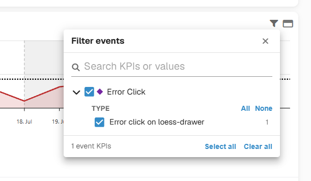
You can:
-
Show or hide individual Marker KPIs
-
Filter markers by field values
Error Click KPI as Marker - GermainUX -
Search for KPIs or values
-
Select or clear all markers
Changes are applied immediately to the visible timeline.
🎯 KPI Relationships and Root-Cause Analysis
KPI Relationships provide one source of evidence for Root-Cause Analysis.
A typical investigation can progress from:
KPI Change → Related KPIs → Affected Population → Individual Instances → Trace / Session Replay → Likely Root Cause
Relationships help identify where to investigate first. The underlying events, transactions, traces, Session Replay, and other monitored evidence help determine what actually occurred.
For example:
Conversion decreases
→ Checkout Page Load Time appears as a strongly related KPI
→ Pivot identifies the affected browser population
→ Individual sessions are investigated
→ Session Replay and related transactions provide supporting evidence
→ Likely cause is identified
This allows KPI Relationships to connect high-level business or experience changes with the detailed evidence available in GermainUX.
📋 Configuration Recommendations
-
Configure relationships on the KPI users will investigate as the source.
-
Use Contributor only when there is a credible contributing mechanism.
-
Use Correlated when KPIs move together but causation has not been established.
-
Use Contextual for events or signals that help explain the timeline.
-
Choose Same or Inverse based on expected numerical movement.
-
Use a correlation field such as
sessionIdwhen instance-level association matters. -
Apply constraints to exclude irrelevant instances.
-
Select a Measure that matches the analytical question.
-
Use Trend for continuous or aggregated signals.
-
Use Marker for discrete events.
-
Validate relationships against historical examples before assigning Strong strength.
Related Documentation
ℹ️ Get Help
The Germain Team can help you set this up. Contact GermainUX Support.
Service: Analytics
Supported Version: 2014.1 or later