Automatic reports can be generated using data from any datastore, whether Germain or external sources.
CSV, PDF, or HTML formats are supported, ensuring compatibility with your preferred tools and workflows.
Reports can be scheduled to generate on a predefined timeline, streamlining your reporting process.
Additionally, an SLA mechanism can be used to trigger report generation based on specific conditions.
Examples
Here are some examples of custom reports created, in minutes, by our clients:
-
Friction report
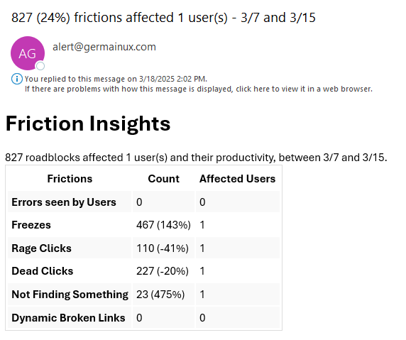
Friction Summary - GermainUX
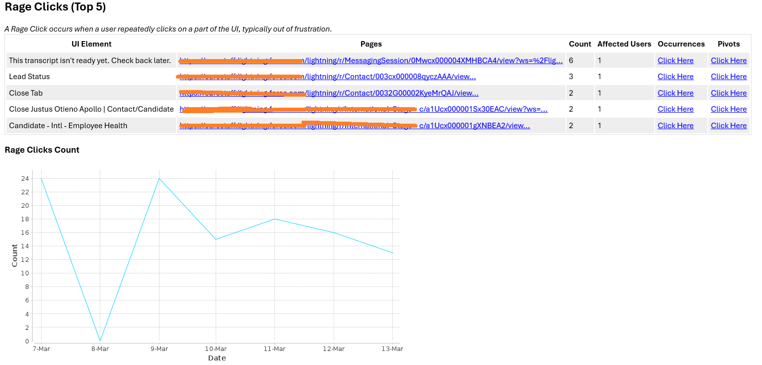
Rage Click Summary - GermainUX -
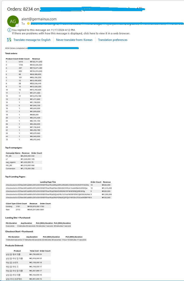
Order Insights Report generated weekly by Germain UX:
-
Out-of-stock product report generated daily by Germain UX:

-
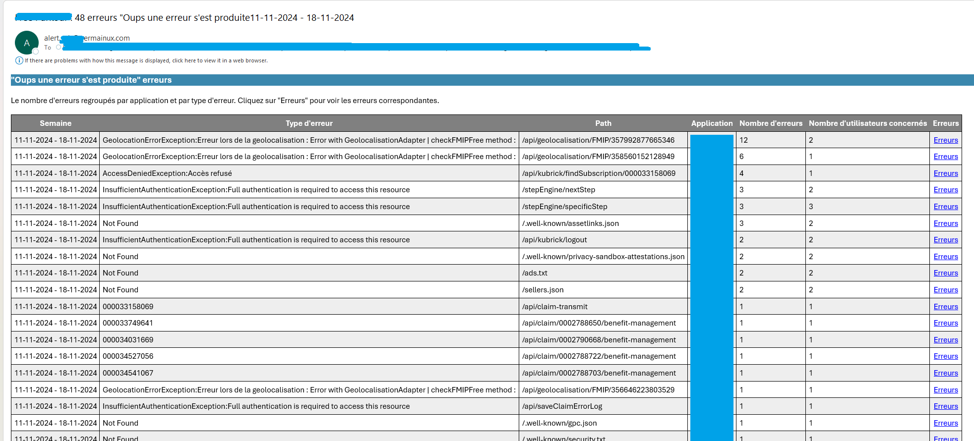
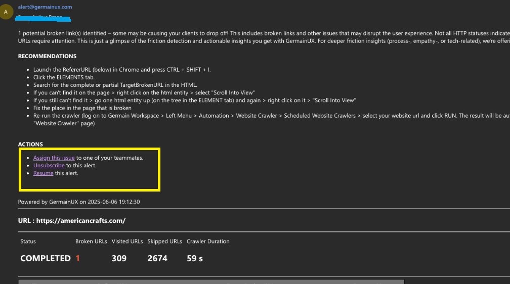
Errors that affected users generated weekly by Germain UX:
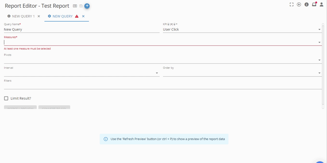
Report Editor
The report editor allows you to edit/preview existing queries, add new queries and navigate to the Report template. It has the following layout:
How to Create a Report
Details on creating a report.
Mute / Unmute Reports
GermainUX allows individual workspace users to mute or unmute automatic reports.
-
This functionality is available only to users logged into the workspace.
-
Behavior is similar with GermainUX’s existing alert muting logic.
Feature Availability: 2024.2 or later