Features
Germain provides a powerful feature called Aggregate View/Dashboard that serves as a starting point for data analysis. This feature allows users to gather and visualize relevant data in a consolidated view and drilldown into 3 other levels to allow further diagnosis.
Aggregate dashboards play a crucial role in analyzing issues and assessing business impact at scale. They provide a comprehensive overview of the data, presenting both technical and business-related metrics. The specific metrics displayed on the aggregate dashboard depend on whether the user is assigned to a technical or business team, ensuring the relevance of the information provided.
From the aggregate dashboard, users have the flexibility to drill down into three other types of dashboards. These drilldown dashboards are designed to cater to different purposes and assist users in achieving their specific goals.
The three drilldown dashboards offer additional layers of detail and analysis, enabling users to delve deeper into the data and extract valuable insights. Depending on the user's objectives, these drilldown dashboards come in handy for different scenarios, such as troubleshooting technical issues, monitoring performance, or evaluating business metrics.
While Germain provides preconfigured dashboards out-of-the-box to facilitate data analysis, users also have the option to customize any of the dashboards according to their specific requirements. This customization feature empowers users to tailor the dashboards to their preferences, ensuring they can focus on the metrics and data that are most relevant to their objectives.
In summary, Germain's Aggregate View/Dashboard serves as a central hub for data analysis, providing a holistic and consolidated view of the data. From the aggregate dashboard, users can drill down into different types of dashboards for detailed analysis. Additionally, the ability to customize dashboards allows users to tailor the visualizations to their specific needs, enhancing the effectiveness of data analysis and decision-making.
4 Levels of Visualization, 2 Types of Metrics
4 types of Dashboards are provided in Germain and to help you analyze whatever KPI you are interested in: Aggregate > Pivot > Drill-through > RCA
2 types of Metrics are provided for all dashboards: Business or Technical Metrics.
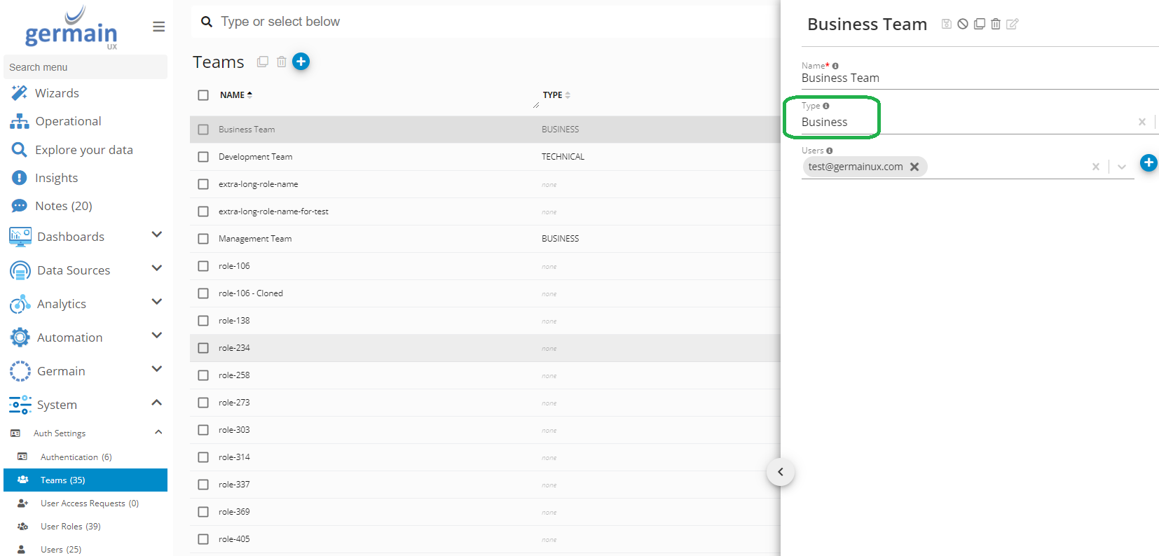
Ask your administrator to assign your User Account to a Team that is either “Business” or “Technical”, so you benefit from either types of dashboards.
Video overview: https://youtu.be/dhtHqxACjqY?si=T2hy7NyJ8Nw6cvSe
Aggregate Dashboard
This is the "Parent" or "top-level" dashboard. Aggregation frequency is configurable.
Add/Remove Aggregate dashboard
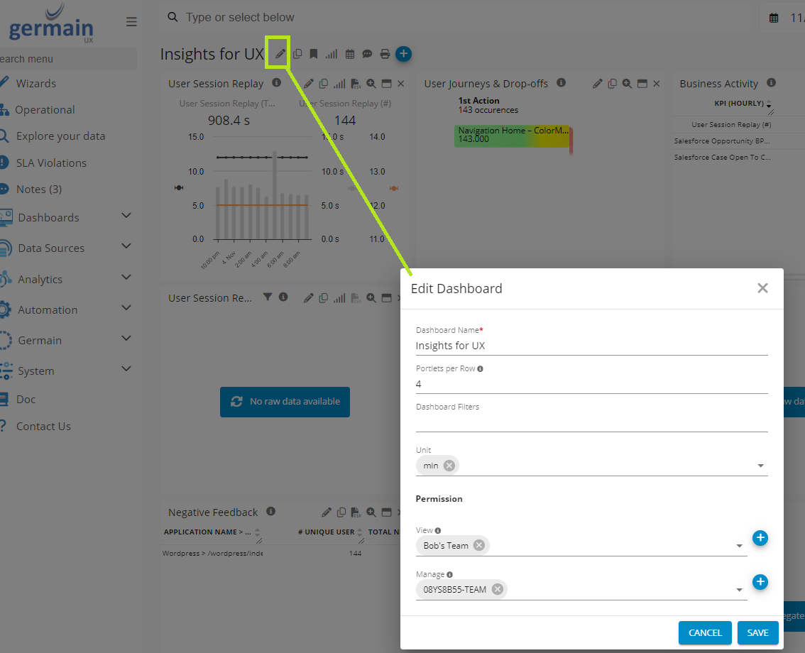
Germain Workspace > Left Menu > Dashboard > All > Click + icon
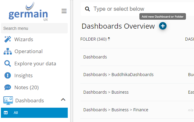
Give it a name, place it in the right folder and make it editable and viewable by either you and/or others.
Filter
Set Dashboard-level Filter can be added at a dashboard and portlet level. Always easier to add a filter at a dashboard level which applies to all portlets.
Video overview: https://youtu.be/sYecZyyBZ8o
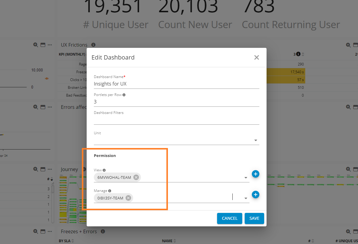
Permissions
Permission levels for accessing or modifying an Aggregate Dashboard:
-
View
Users or teams with visibility access to an aggregate dashboard.
-
Manage
Users or teams authorized to edit an aggregate dashboard.
Portlets
A portlet is like a widget and visualizes your data. More details on portlets here.
Germain UX provides 8 types of portlets.
General Health Portlet
Shows trend or aggregation of data.
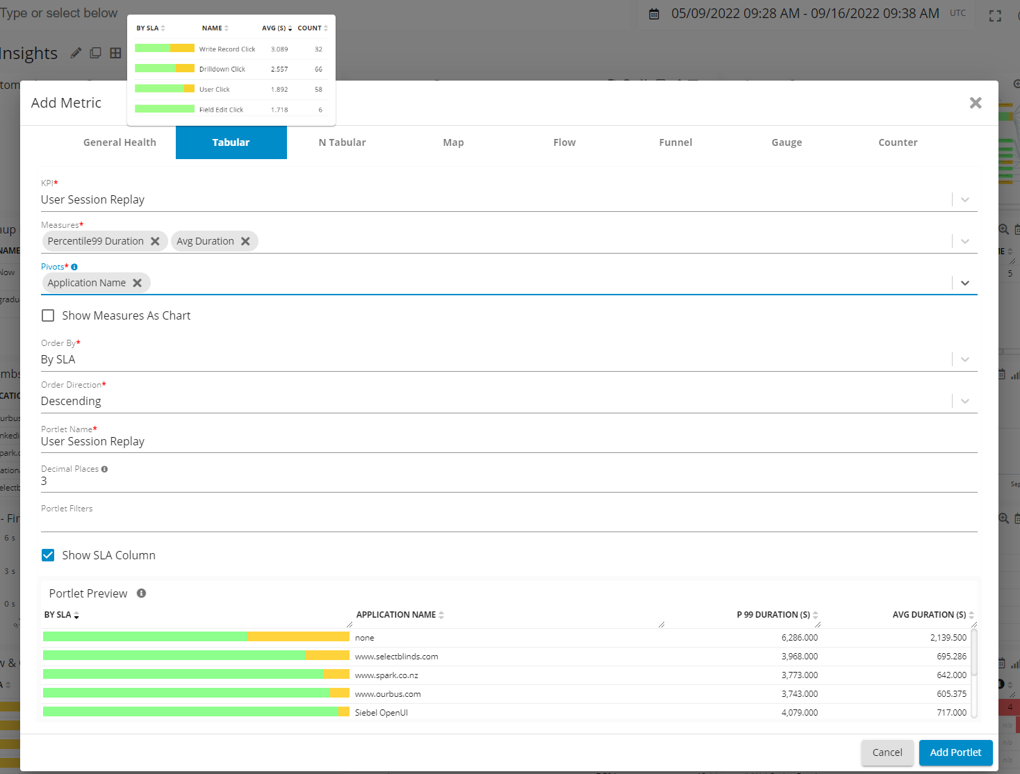
Tabular Portlet
Shows aggregated data pivot by a level.
N-Tabular Portlet
Shows data from multiple KPIs in a tabular format.
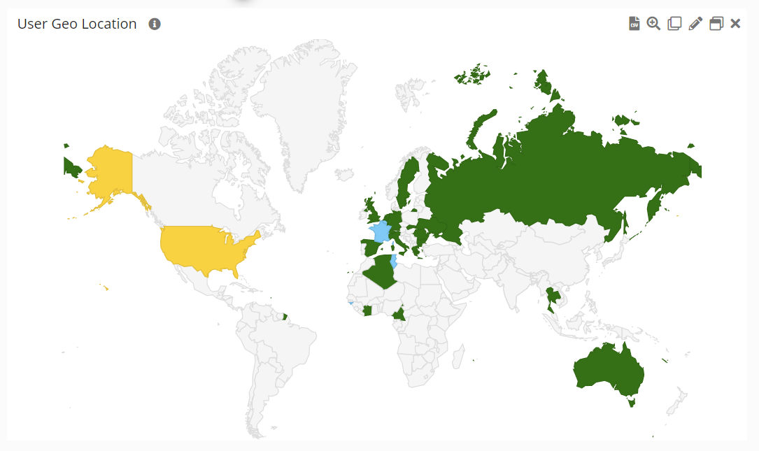
Map Portlet
Google web service access need to be provided (see details in Software Requriements > Firewall/Network requirements)
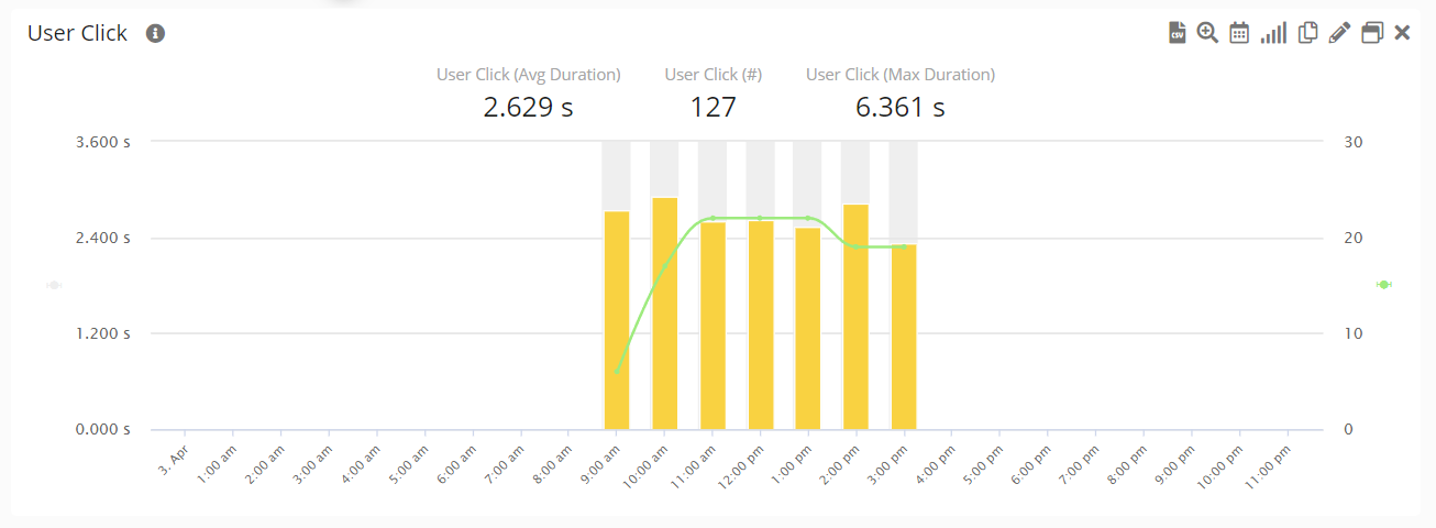
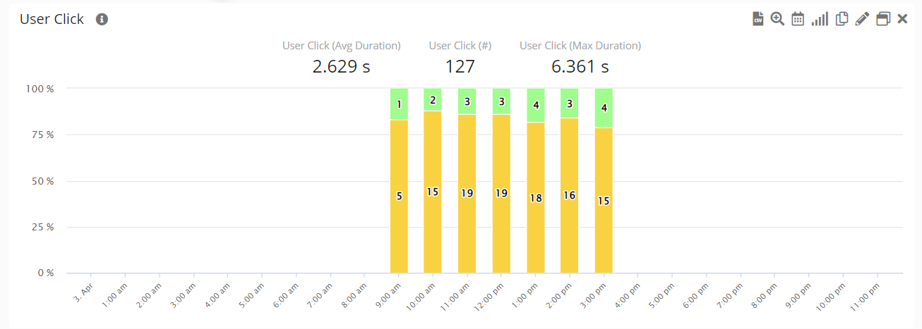
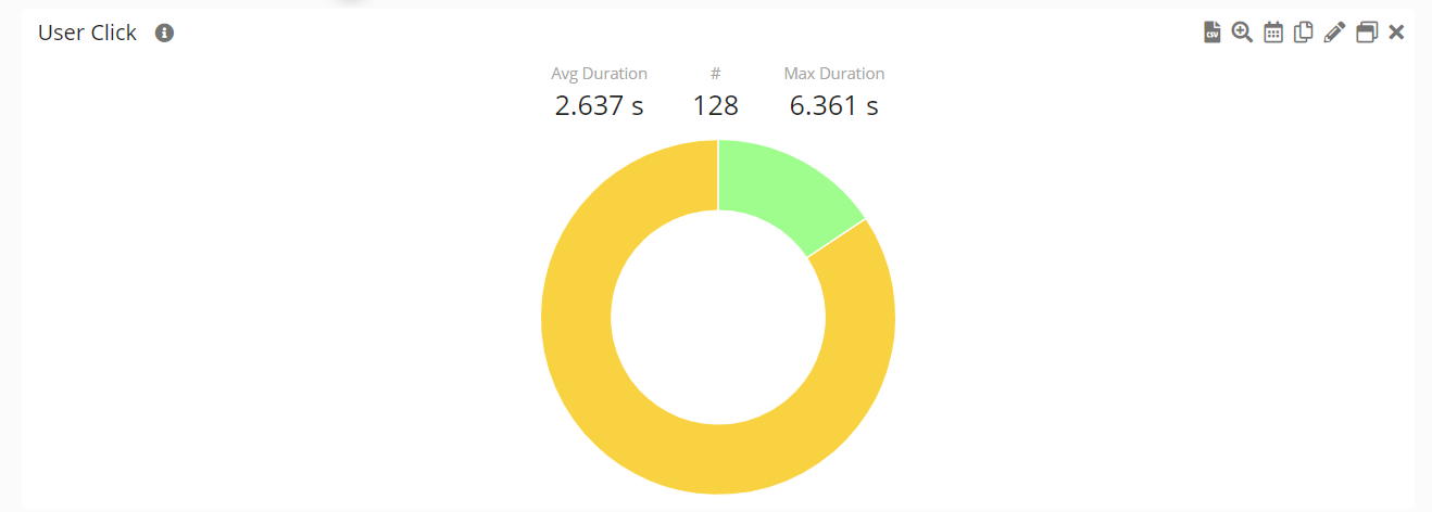
Flow Portlet
Customer Journey, Workflow or Click-related data.
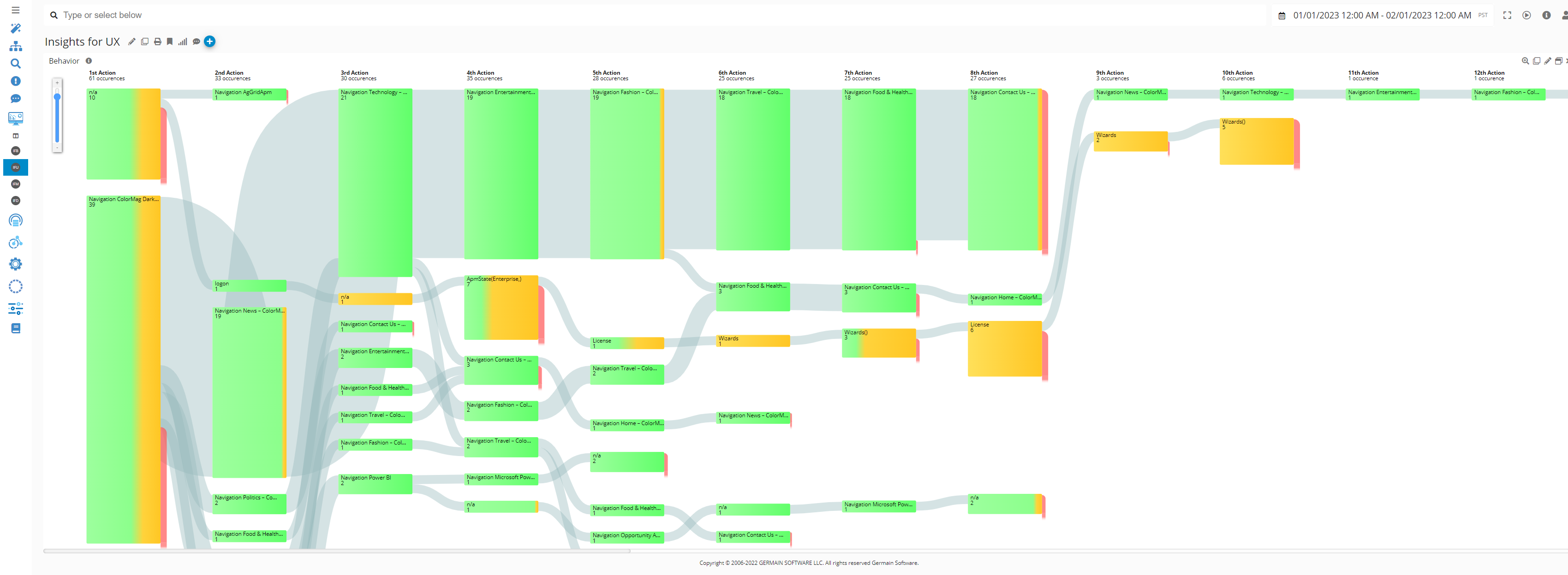
Focused Flow
Focused Flow is an innovative method for analyzing user behavior and identifying the friction points they encounter. It enables a detailed breakdown of each milestone in the user journey, even at scale.
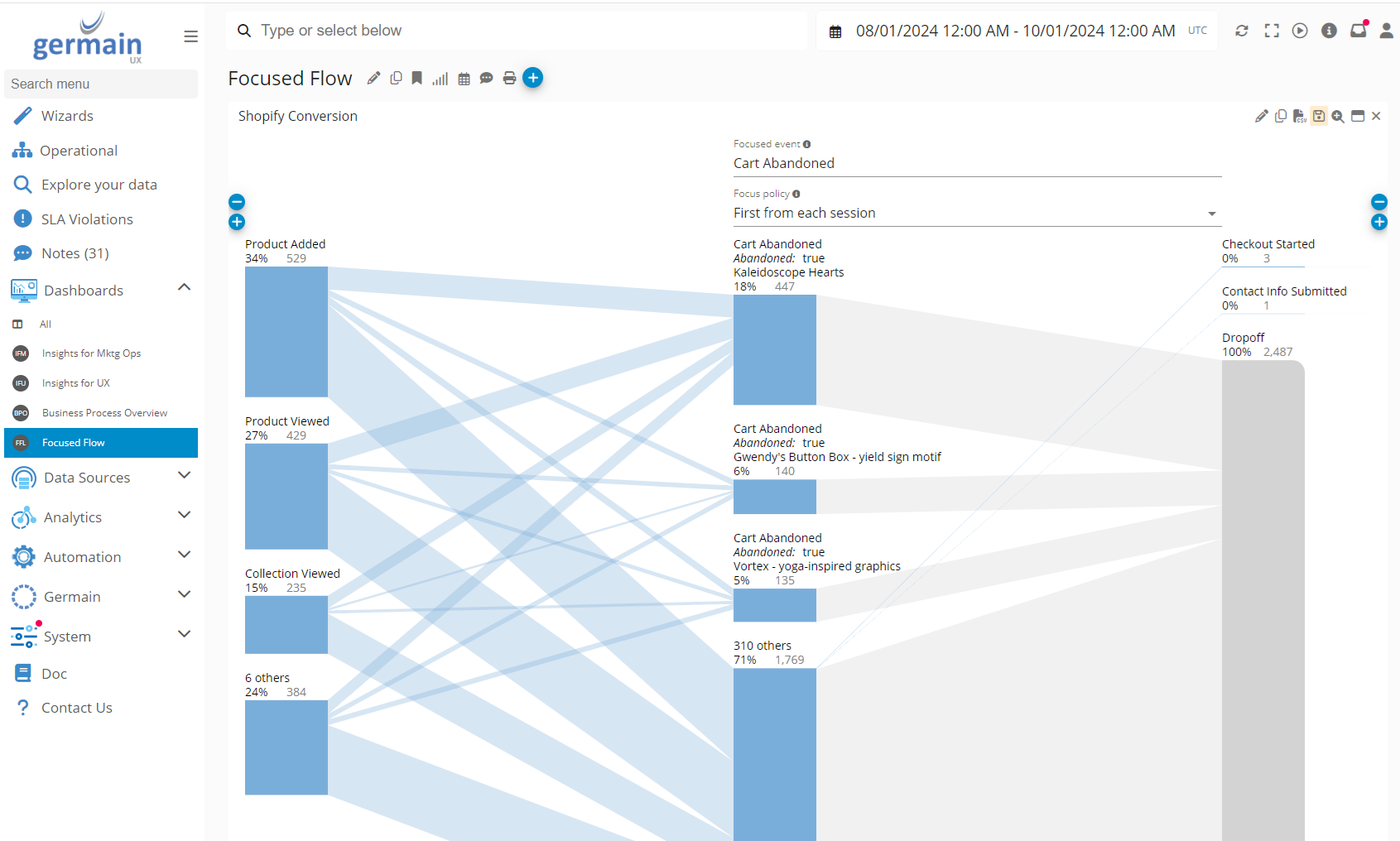
Focused Flow works for any application; however, some options vary depending on the application.
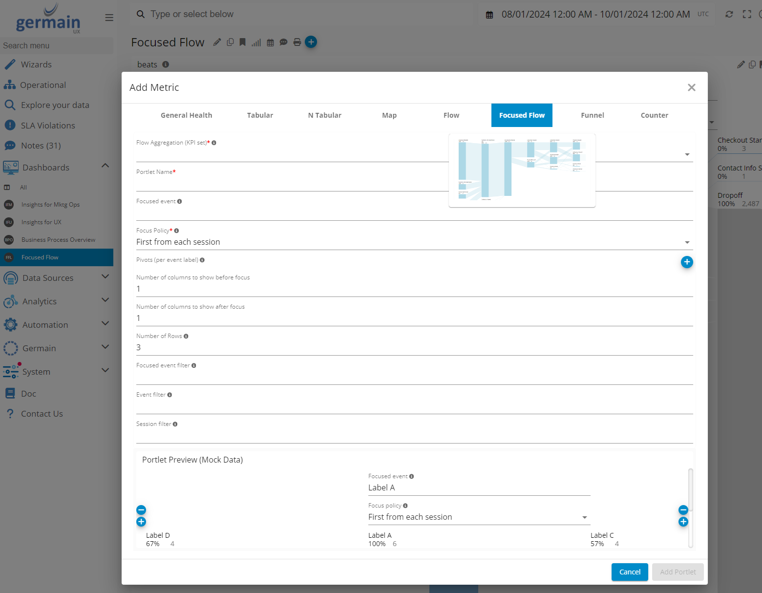
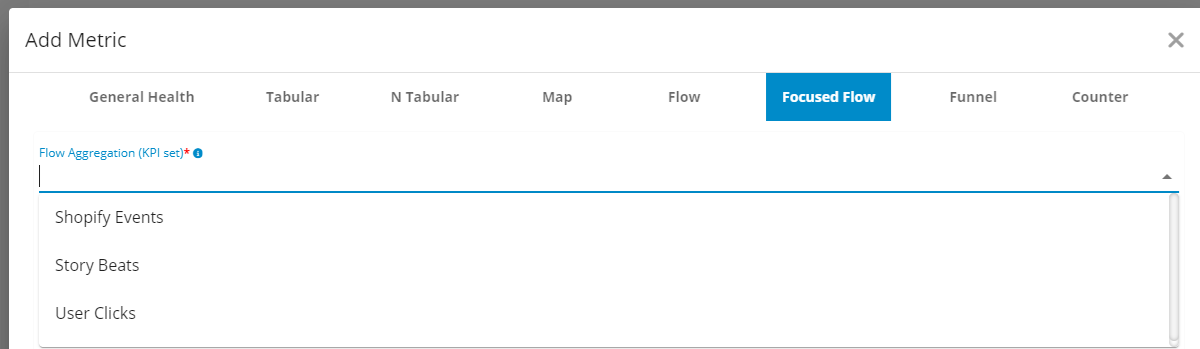
3 KPIs can be used on a Focused Flow portlet:
-
Shopify Events
-
Story Beats (more details).
-
User Clicks
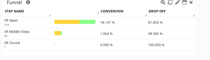
Funnel Portlet
Funnel portlet are there to visualize Business Process/Workflow data.
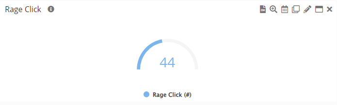
Gauge Portlet
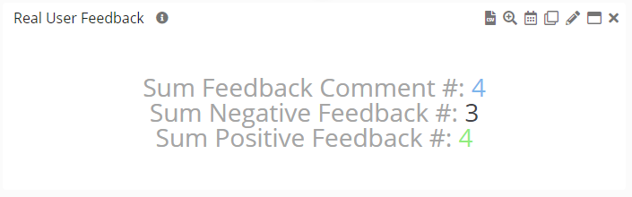
Counter Portlet
Add Portlet
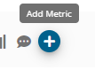
Click the + icon (Add Metric) on any Aggregate
Edit Portlet
Portlet Constraint
A basic constraint is defined as
(<model-attribute> == '<value>')
Where <model-attribute> is a specific model attribute from an object and <value> is the value of the constraint. For example, if there is a user with the username jsmith, then in order to limit the data of a portlet to just data associated with jsmith, you would specify
(user.name == 'jsmith')
You can create specify more than one member using the following
(user.name == 'jsmith') || (user.name == 'bjones')
This is essentially asking for data associated with jsmith or bjones.
If you need to constrain more than one dimension the syntax is as follows
((user.name == 'jsmith') || (user.name == 'bjones')) && (application.name == 'Siebel')
Now we're specifying jsmith or bjones (users) and Siebel (application).
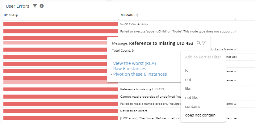
Portlet Filters
Ability to quickly apply filters like 'is,' 'is not,' 'is like,' 'is not like,' 'contains,' or 'does not contain' for a specific string, such as 'Error%.' . That filtering works for any KPIs and empowers you to focus and enhance the precision of your analysis.
-
Filter via any metric or text.
-
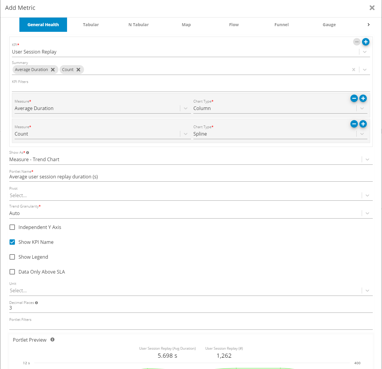
Filter via Add Metric
Another way to add a more permanent filter to a portlet is to edit the portlet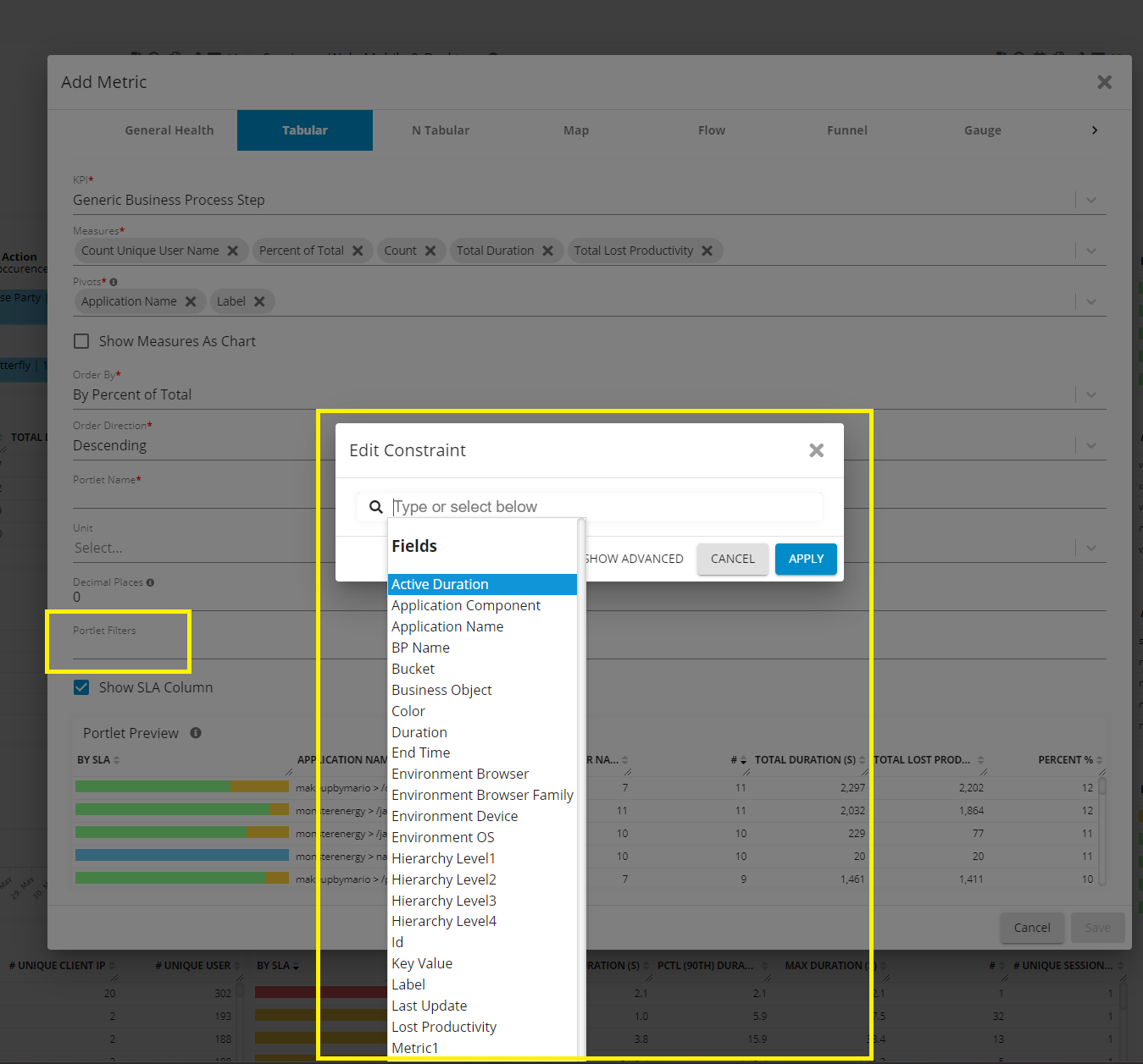
Add a Filter/Constraint to a Portlet - Germain UX
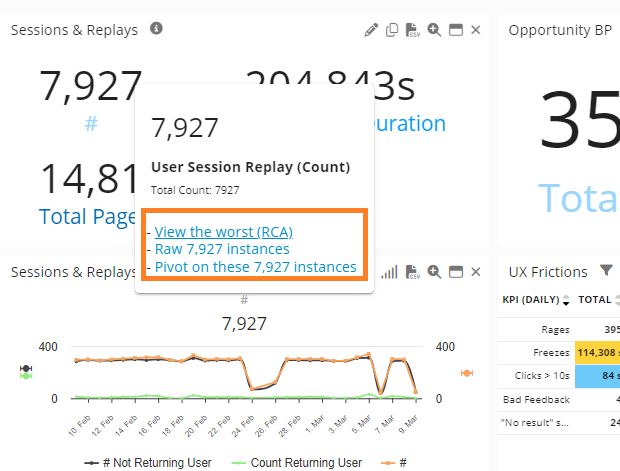
More Insights
3 Ways to further analyze your KPI:
-
Add a Measure
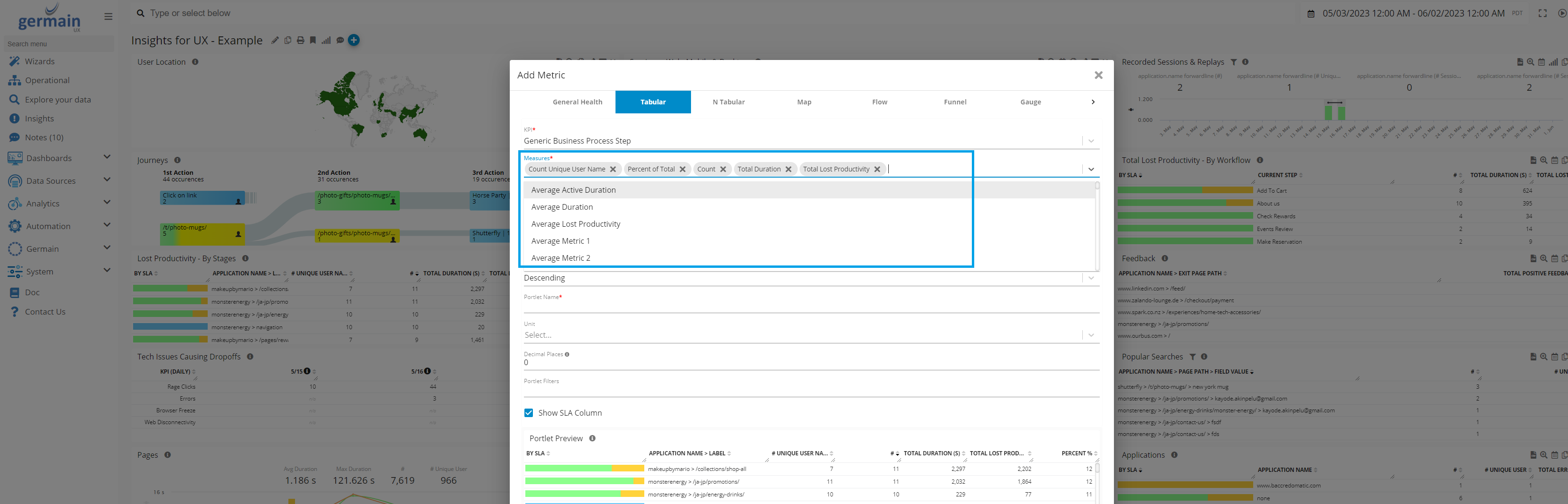
Add Measure to a KPI on a Portlet - Germain UX
-
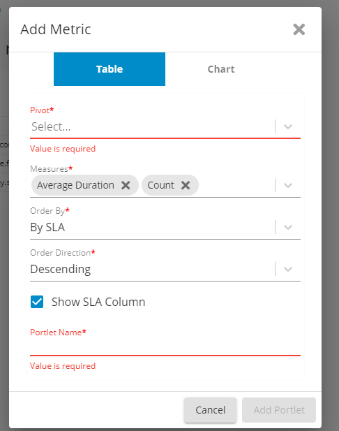
Add a Pivot
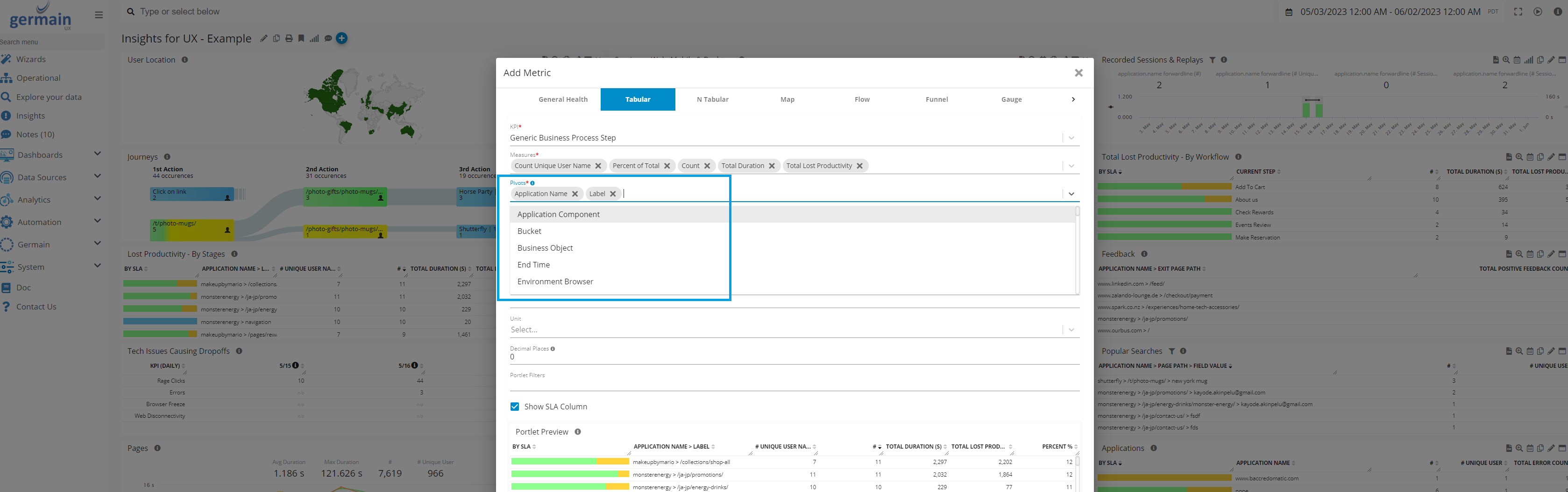
Add a Pivot - Germain UX
-
Change Pivot order
You can now easily reorder configured pivots in the Tabular Portlet through drag-and-drop of Pivot Column headers. This helps better assess impact at scale.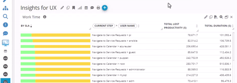
pivot reordering example - Germain UX
Display Name for Pivot and Measure
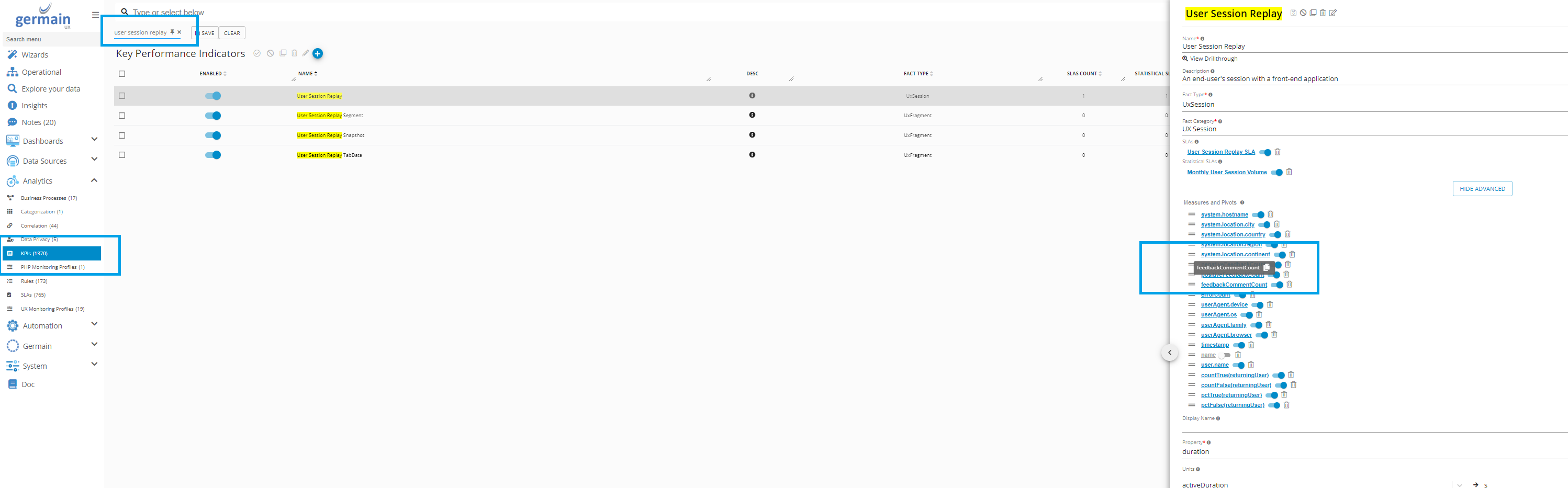
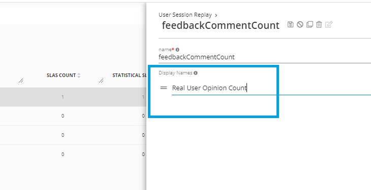
All the Pivots and Measures that are available for a given KPI, can be renamed on the KPI screen
Germain Workspace > Left Menu > Analytics > KPI
Example: If you want to rename “Total Feedback Comment #” to “Real User Opinion Count”
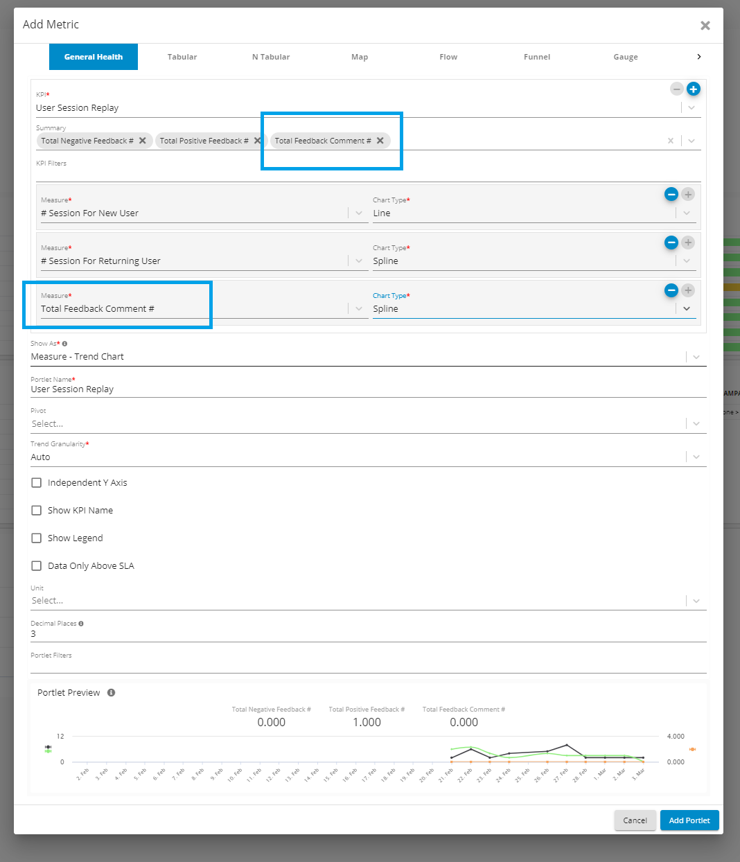
then you go : Germain Workspace > Left Menu > Analytics > KPI
Search for “User Session Replay”
Select “FeedbackCommentCount” and change Display Name to “Real User Opinion Count”
Drilldown on Aggregate Dashboard
3 Drilldowns come by default on all aggregate dashboards: Pivot, Drill-through or RCA Dashboard
Manage Aggregate Dashboard
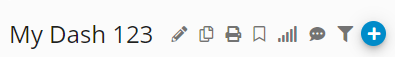
Edit Dashboard | Clone Dashboard | Print Dashboard | Trend Granularity | Create a Note/Ticket
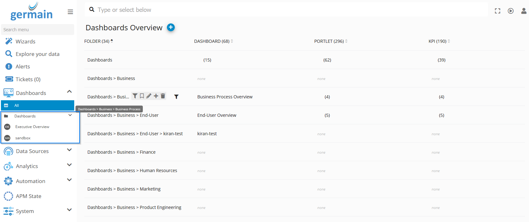
Preconfigured Aggregate Dashboards
List of all Aggregate dashboards that are either preconfigured out-of-the-box or created by your team.
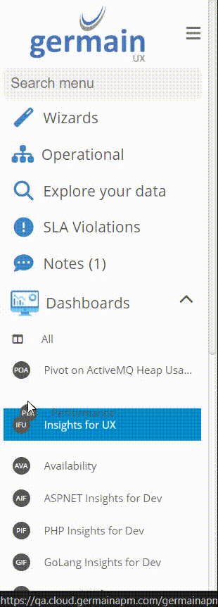
Log on to Germain Workspace > Left Menu > Dashboards > All
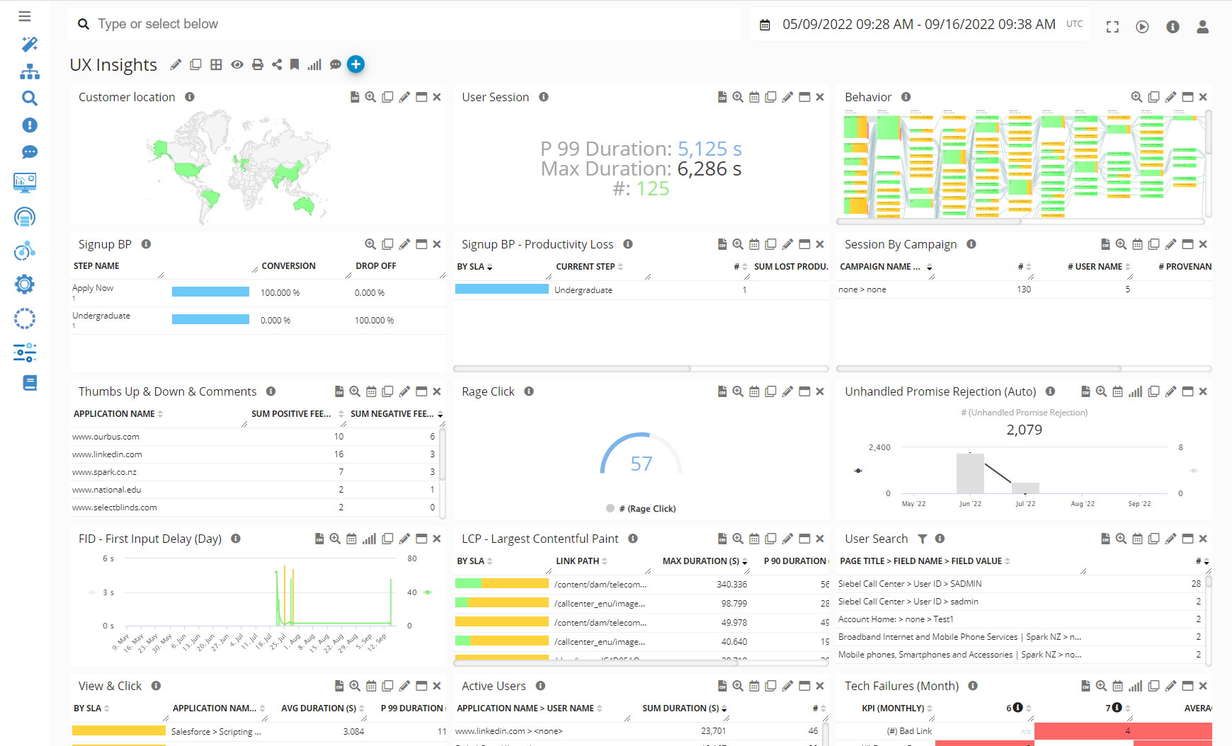
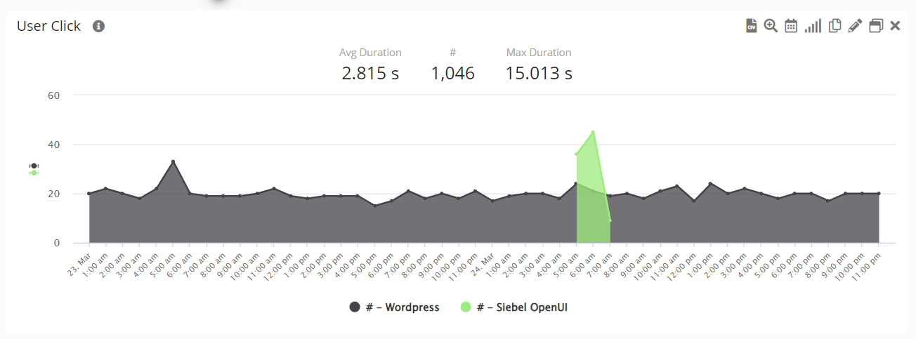
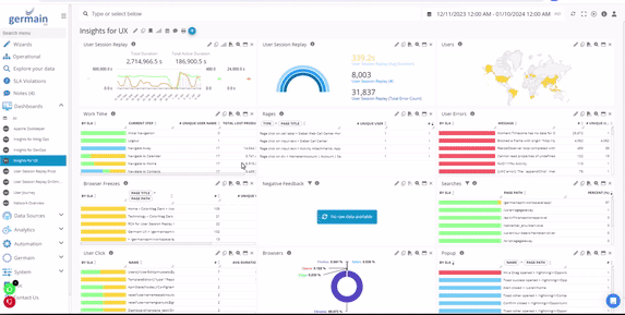
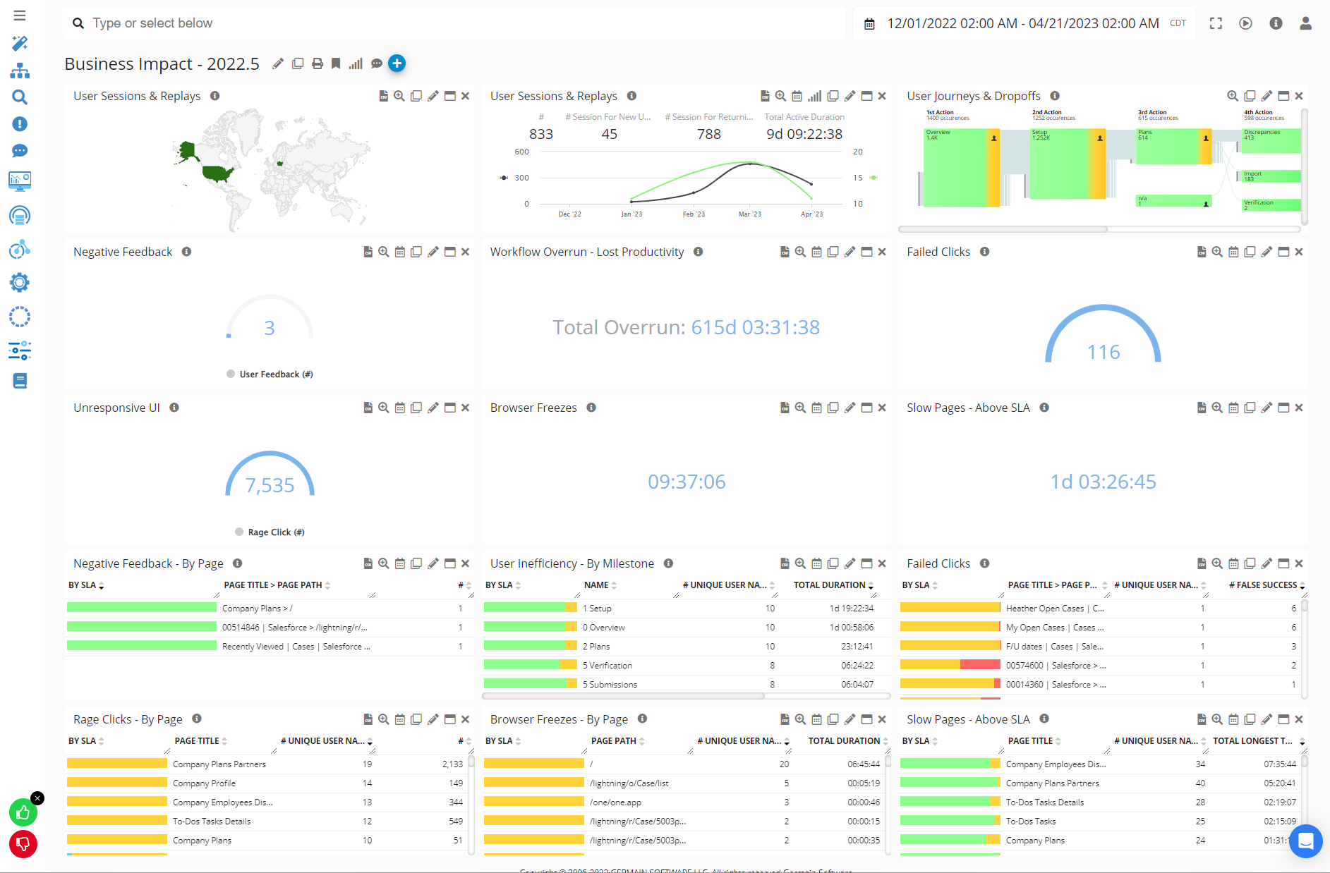
Business Impact at Scale
Example of an Aggregate Dashboard that reports real-time insights, at scale, and helps understand the business impact of any issues.
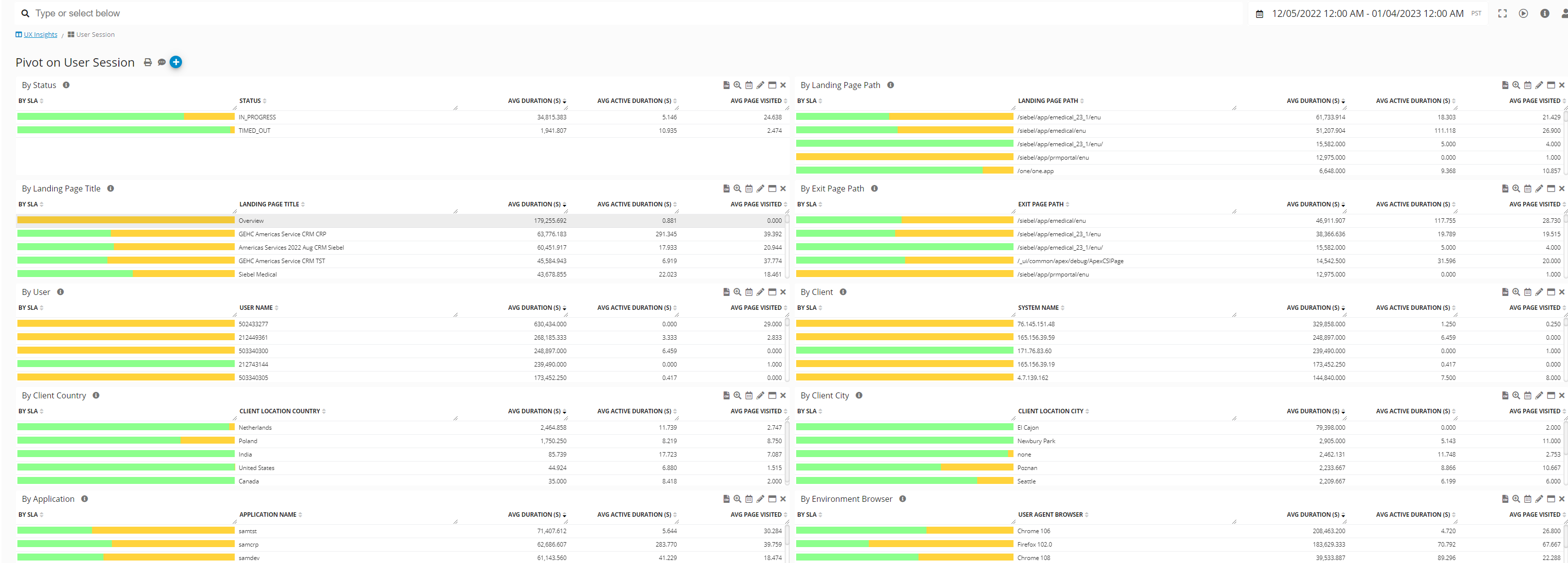
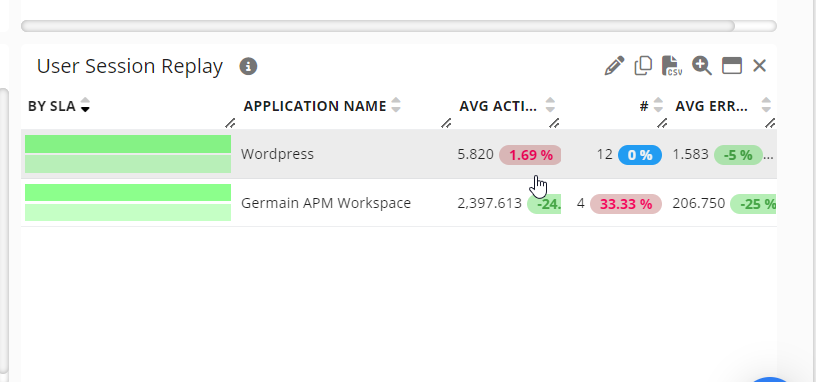
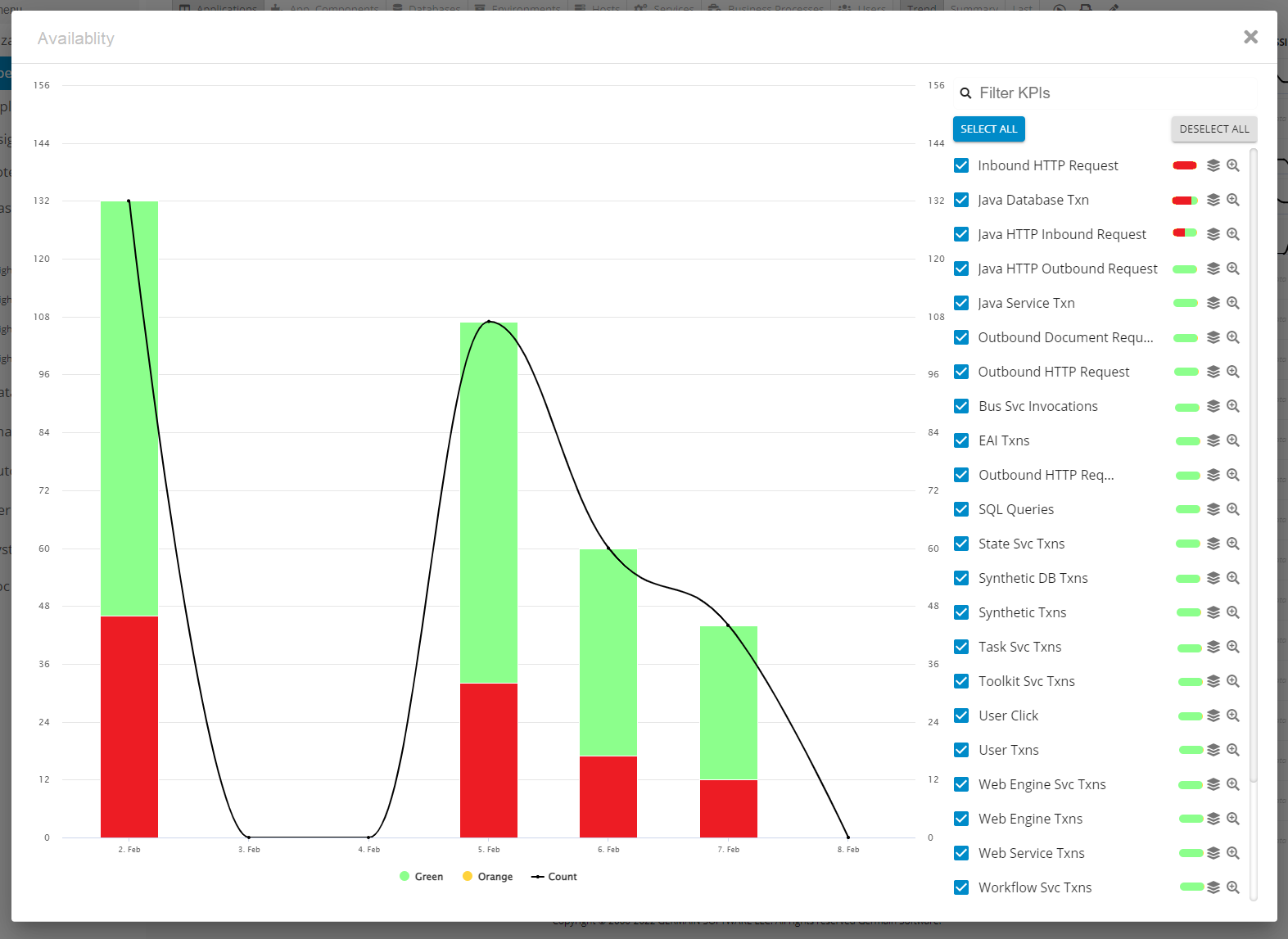
Pivot Dashboards
This is the "2nd level" dashboard. Data at this level is aggregated and a break-down analysis of the data that is displayed on the portlet you click on/from (on the Aggregated Dashboard).
-
Create/Edit
Pivot Dashboards are automatically generated after you create an Aggregate Dashboard. However you may also want to either modify or create your own pivot dashboard from scratch.
Click + icon on the Pivot Dashboard
-
Portlets
-
Filter
Filters are inherited from the Aggregate Dashboard. yet you can modify them as you wish.
-
Visibility
Visibility is inherited from the Aggregate Dashboard.
-
Drilldowns
2 Drilldowns come by default on all Pivot dashboards: Drill-through or RCA Dashboard
-
Manage
Edit Dashboard | Print Dashboard | Create a Note/Ticket
-
Example
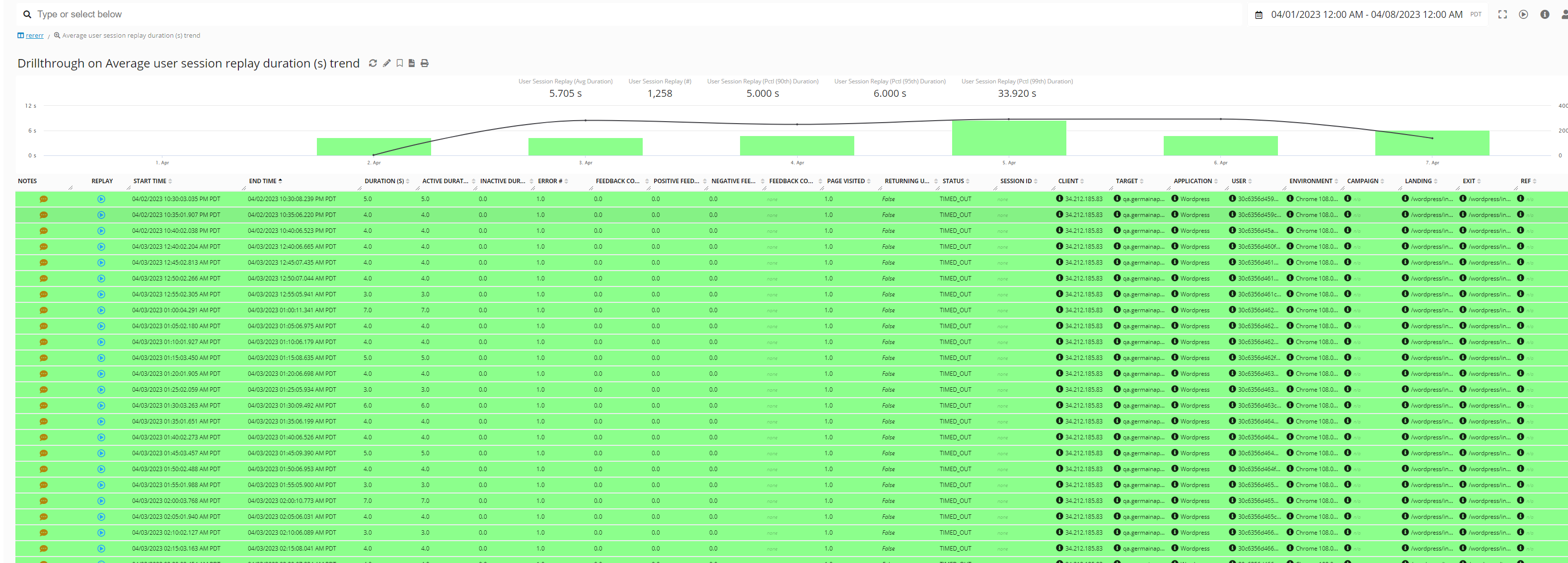
Drill-through Dashboards
This is the "3rd level" dashboard you can see/create. This shows Raw data.
-
Access/View
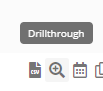
Click the +/binocular icon from any Aggregate or Pivot Dashboard,
-
Create/Edit
On Config Console: to be used if you need to manually add a drill-through dashboard
On Workspace: Add/Remove Field
-
Filter
Filters are inherited from the Aggregate Dashboard. yet you can modify them as you wish.
-
Visibility
Dashboard visibility is inherited from the one defined at the Aggregated dashboard.
-
Drilldowns
1 Drilldown come by default on all Drill-through dashboards: RCA Dashboard
-
Manage
Refresh | Edit | | CSV Report | Print Report:
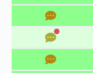
Add/Edit a Note:
-
Example
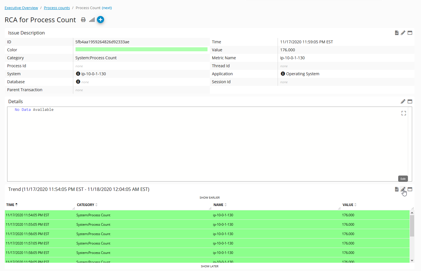
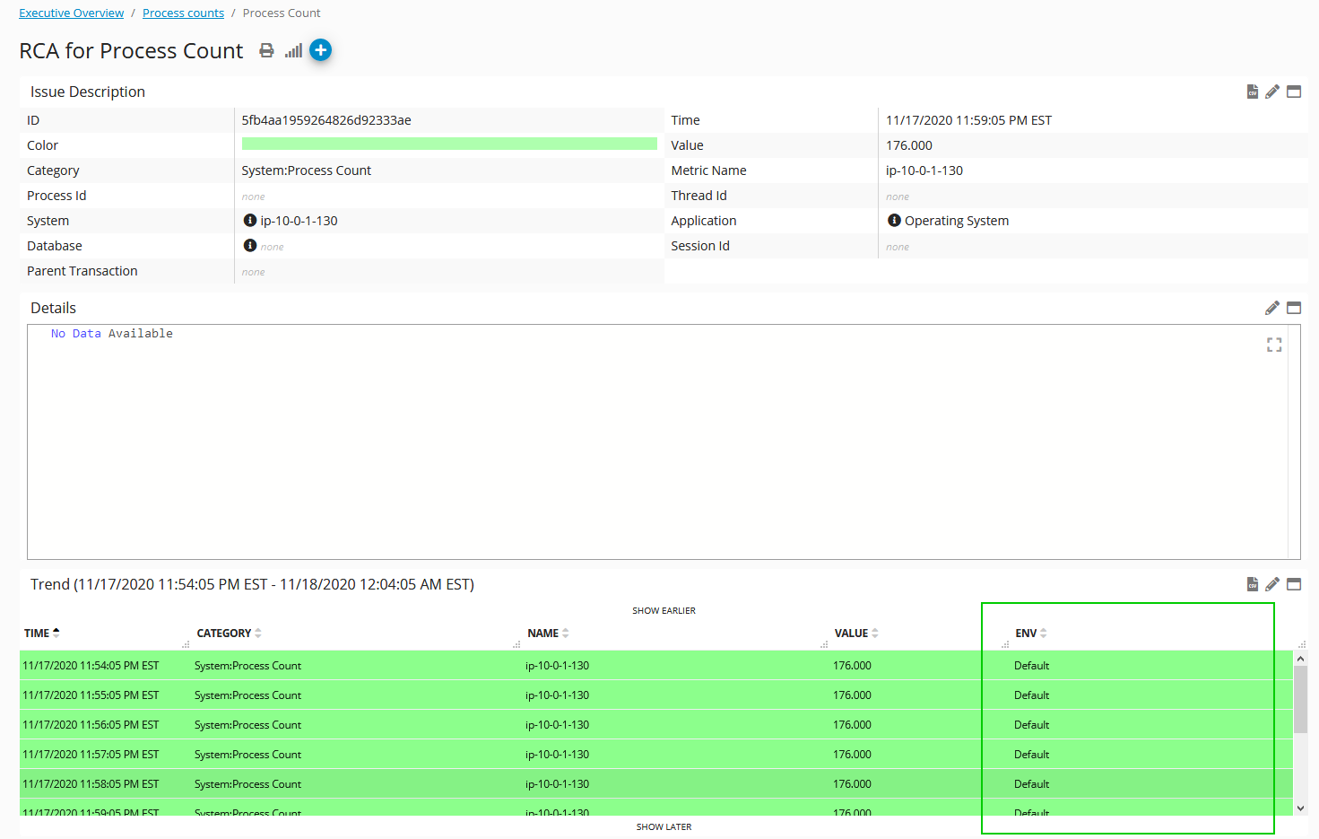
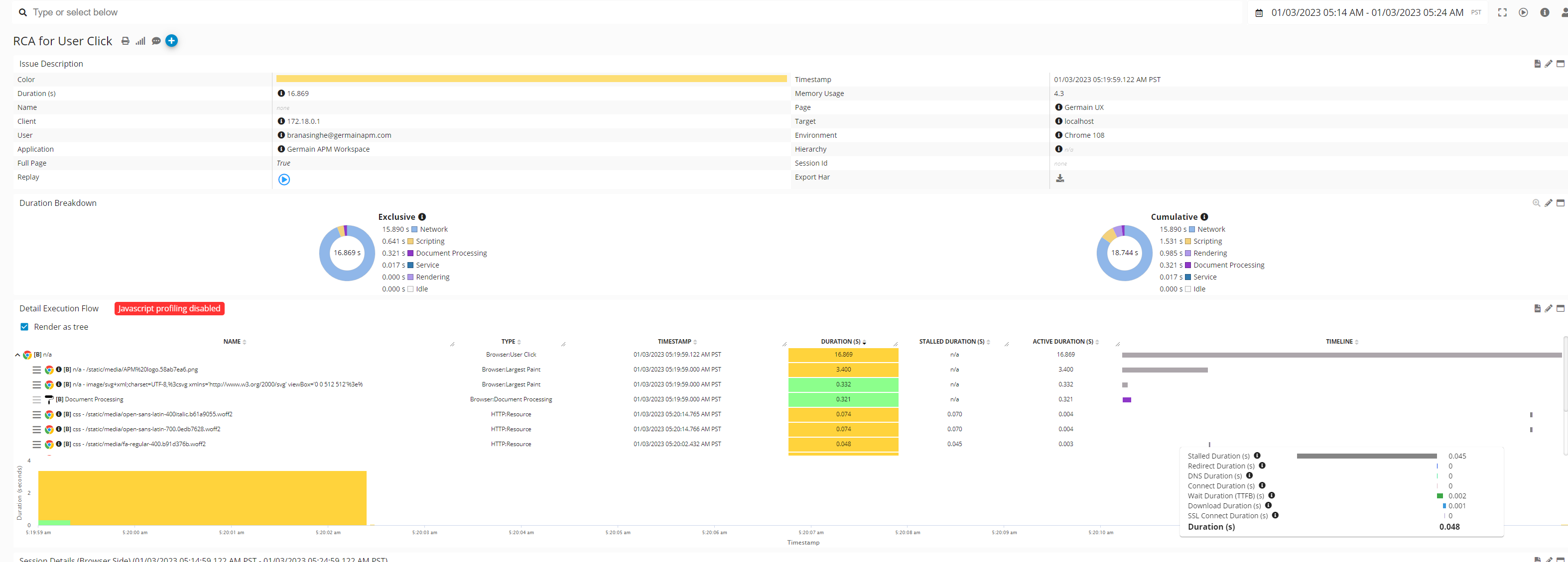
RCA Dashboards
RCA/Root-Cause Analysis Dashboard is the "4th level" visualization or analysis. It shows Raw data.
-
Access/View
A single click from Aggregate, Drill-through or Pivot Dashboard. The type of RCA dashboard varies and depends on the type of metric you drilldown onto.
-
Create/Edit
Config Console to be used if you need to manually add a RCA dashboard
-
Filter
Filters are inherited from the Aggregate Dashboard. yet you can modify them as you wish.
-
Visibility
Dashboard visibility is inherited from the one defined at the Aggregated dashboard.
-
Drilldowns
Recursive Drilldown to other RCA dashboards.
-
Manage
-
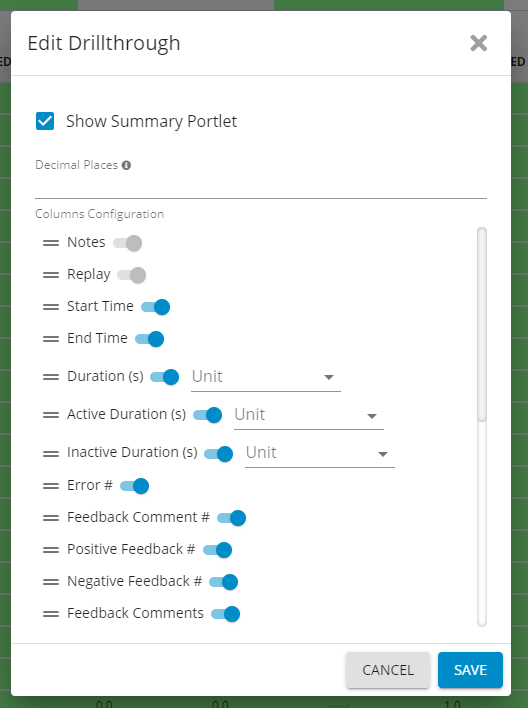
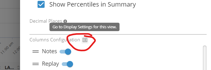
Enable or Disable a Column
-
Open the RCA Dashboard you with to modify
-
Click the edit button on the portlet you wish to change
-
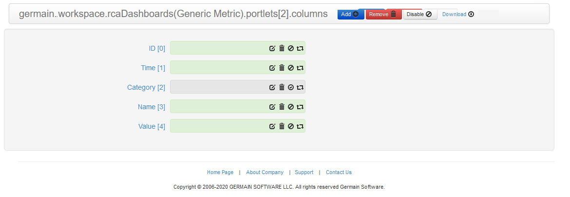
Click “Columns (#)”
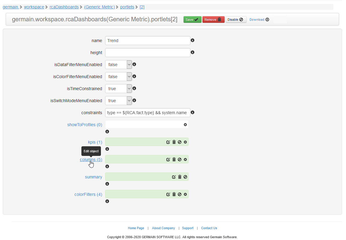
-
Here you can enable or disable and column via the third icon ( 🚫
)
-
-
Adding a new Column
After you are on the column list using the instructions in “Enable or Disable a Column” you could create a new column. -
Clone an existing column
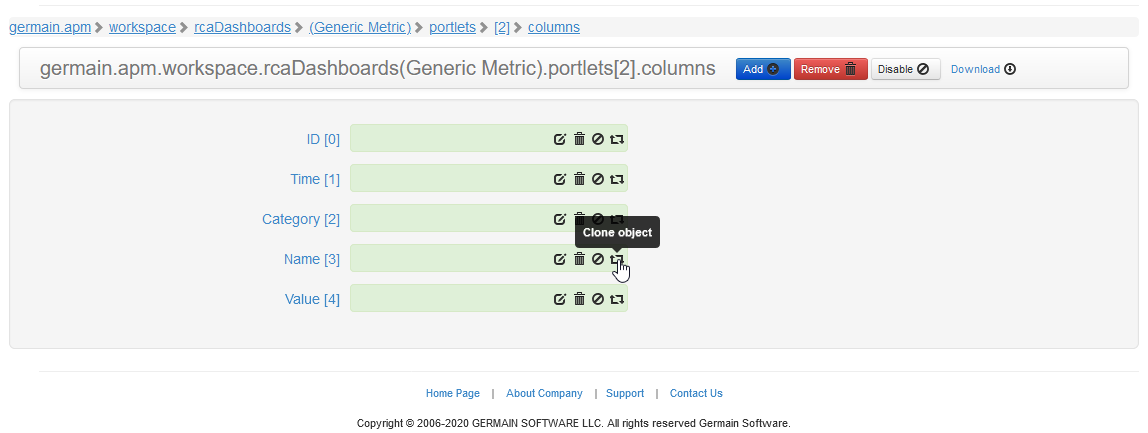
-
Click on the clone
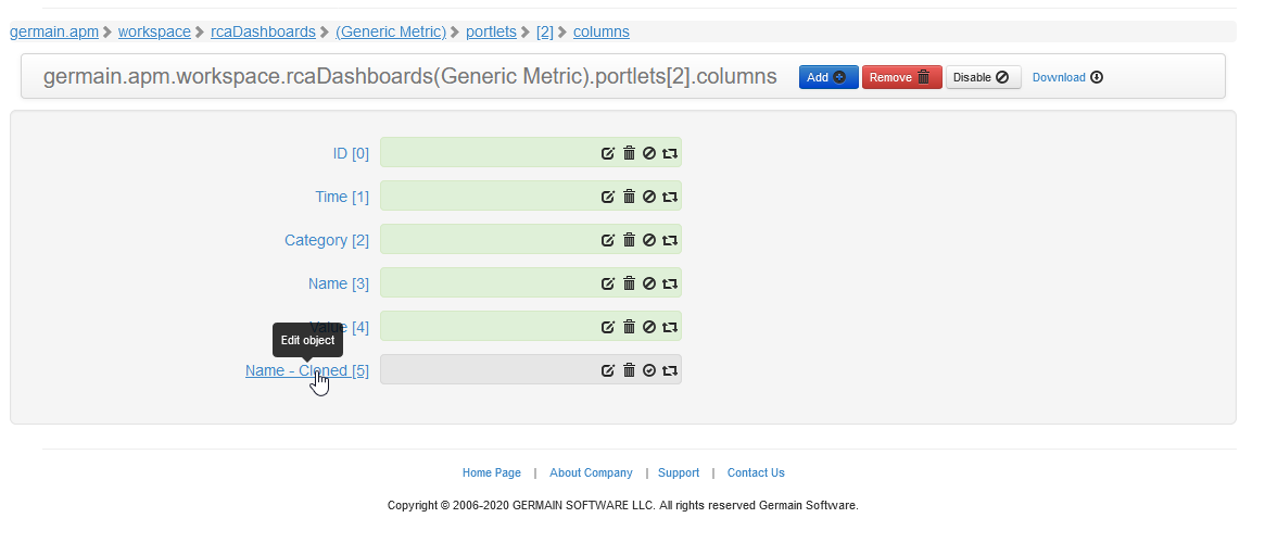
-
Modify the details for the column
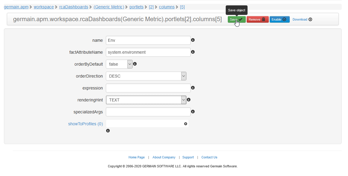
-
Save, then enable the column
-
Review the change on the RCA Dashboard
-
-
Example
Compare To
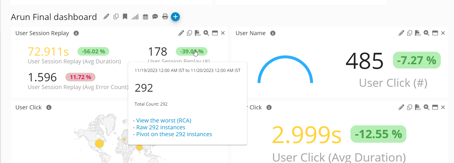
Now, it's more convenient to spot increases or decreases across any Aggregate, Pivot, Drillthrough, or RCA dashboard for any KPI.
Earlier this year, we relocated the 'Compare to' feature from the Portlet to the Dashboard level. While initially, only an extra trend graph was displayed, we have now expanded its functionality. In addition to the trend graph, absolute deltas are visible, highlighted in green for increases and red for decreases.
-20240109-221349.gif?cb=ac604f5befee06432f2ee51c21e96694)
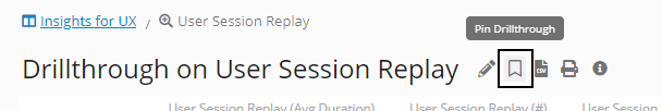
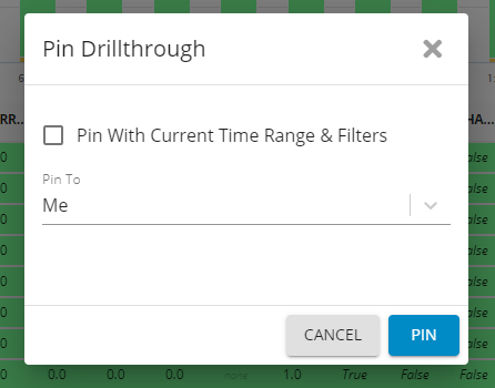
Pin your Dashboard
Ability to pin any Aggregate, Drill-Through or Pivot dashboards. This way, you can conveniently access them from Germain UX’s Workspace Menu.
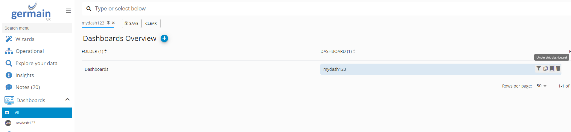
Reordering Pinned Dashboards
You can reorder of all User-Pinned Dashboards under Workspace Menu > Dashboards.
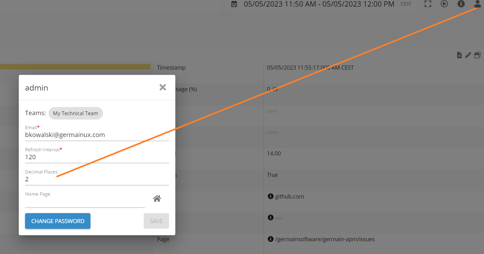
Decimal Point
Germain Users have the capability to establish a default Decimal Point setting at the Germain UX Workspace Level. As a result, there's no longer a need to manually configure it for each individual Portlet across all Dashboards. Moreover, this setting can be customized at the portlet or dashboard level, allowing for specific overrides as required.
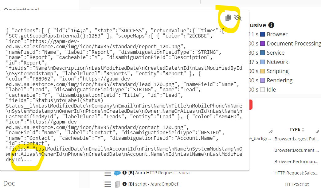
Clipboard Copy
Many insights like this one are now fully copied to the Clipboard.
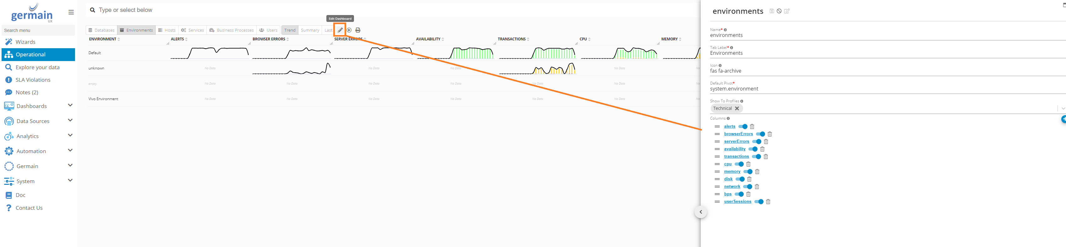
Operational Dashboard (360 Degree View)
360 degree view of your Process, User and Technology performance.
One stop-shop for IT and Business Operations organizations. The Operational dashboard is all you need to look at when you work in operations and need to know what is the state of your technologies, processes and users involved with them.
Data is aggregated across KPIs. Data is coming from our our Real-Time Data engine, giving real-time insights.
Video overview: https://youtu.be/1VHjl0oaAFs
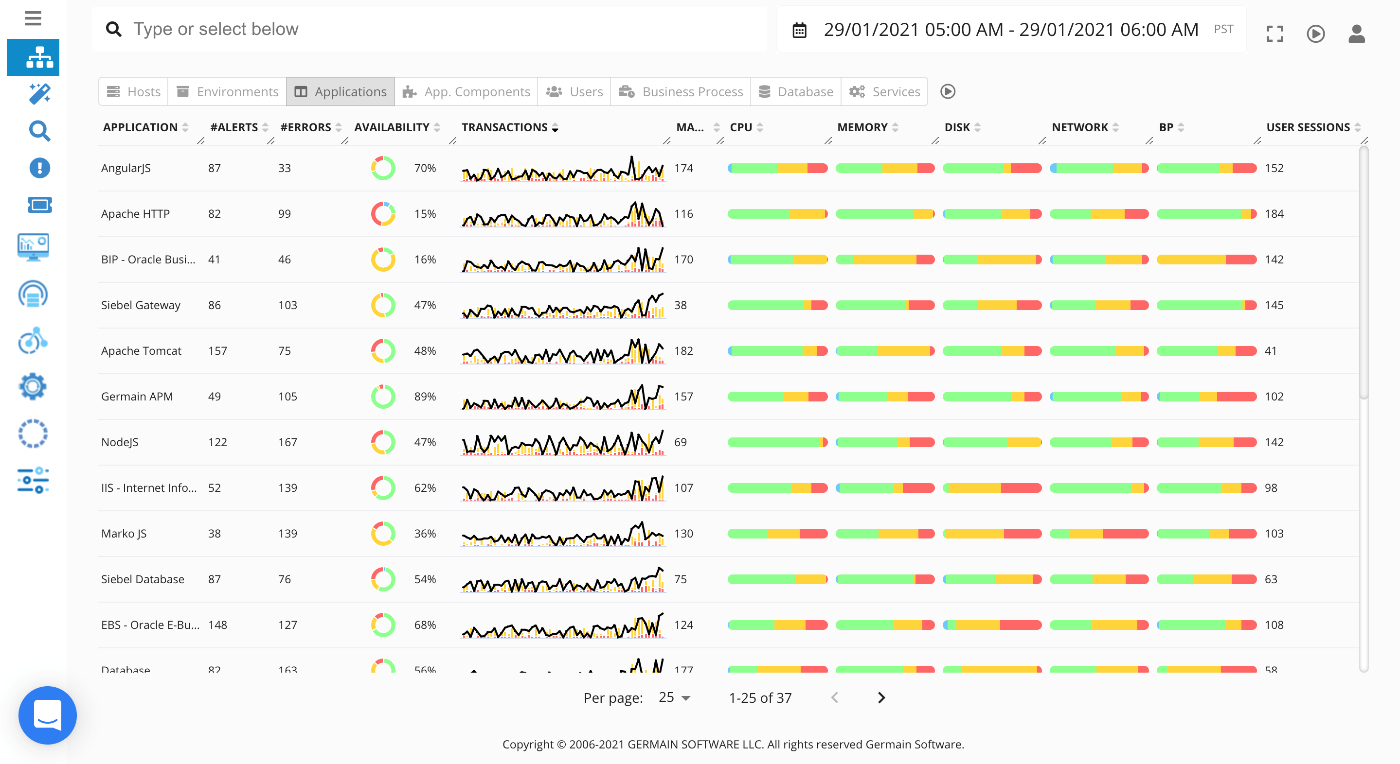
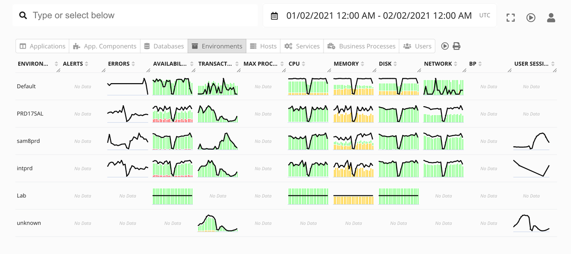
Like anything else in Germain, all this is customizable. The Edit button enables the customization of the Operational Dashboard. Users can easily add or remove columns across all tabs for a personalized experience and a 360 degree view that fits their Organization and Operational needs.
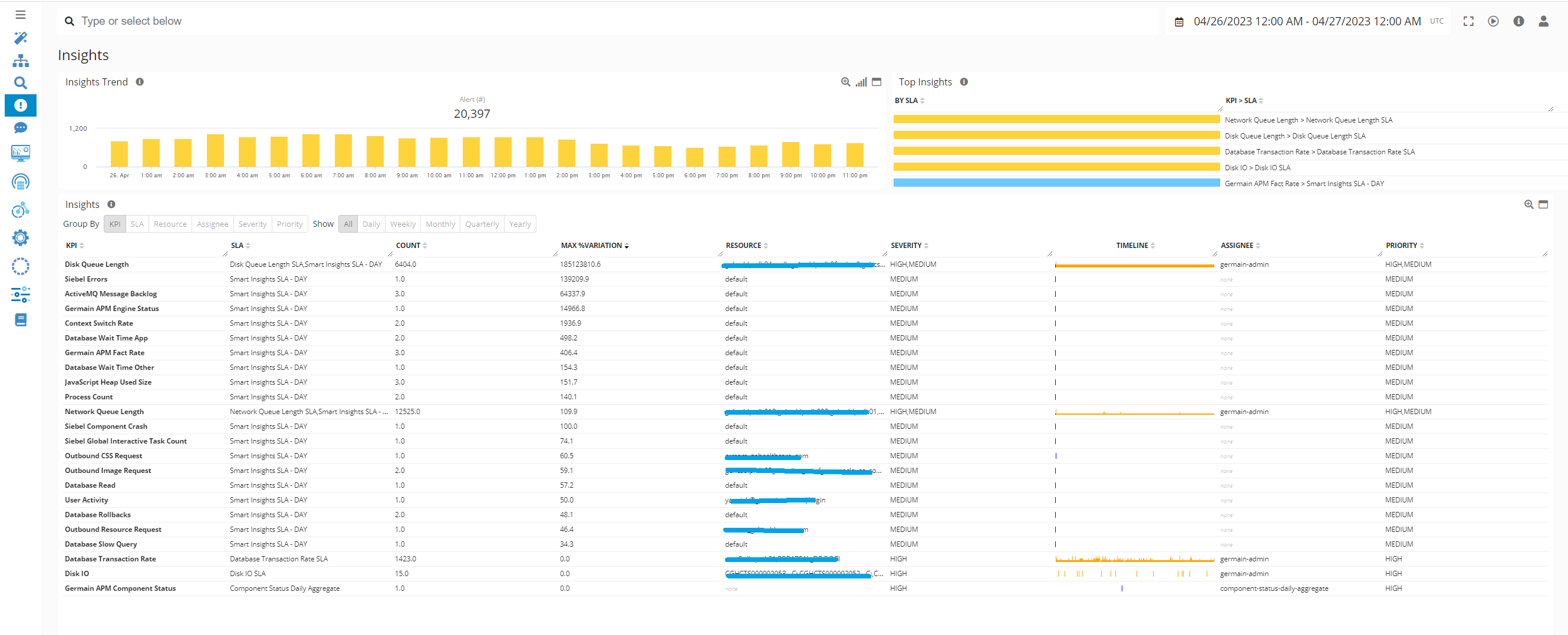
SLA Violation Dashboard
It is called Insights Dashboard in older version and called “SLA Violation” dashboard and reports your SLA Violation by Severity/Priority/Max Variance...
Max Variation helps find biggest/new issues.
Component Internal: Workspace
Feature Availability: 8.6.0 or later