
Aggregate Dashboard Overview and Features in GermainUX Analytics
📊 Overview
The Aggregate Dashboard is the first level of GermainUX Analytics Dashboards.
It provides an aggregated view of business and technical KPIs so teams can monitor performance, identify changes, quantify impact, and determine where deeper investigation is required.
From an Aggregate Dashboard, users can continue to:
Pivot → Drill-through → Analysis
🧩 Portlets
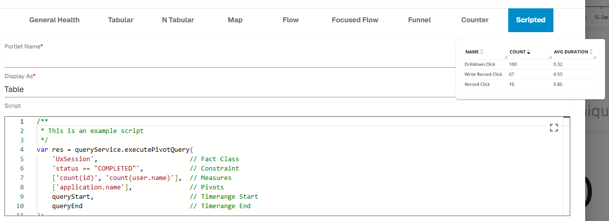
Portlets are configurable visualizations used to display KPI data.
Available visualizations include:
|
Portlet |
Purpose |
|---|---|
|
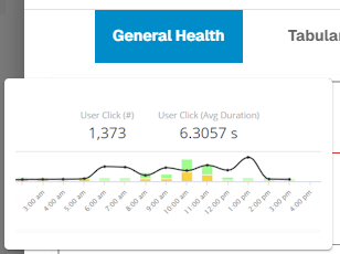
General Health |
Display trends and aggregated KPI health.
|
|
Tabular |
Break down data by one or more dimensions. 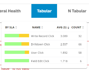
|
|
N-Tabular |
Display multiple KPIs in one table. 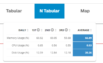
|
|
Map |
Visualize geographic data. 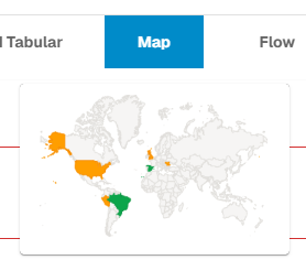
|
|
Flow |
Visualize customer journeys, workflows, or click paths. 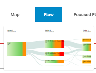
|
|
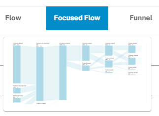
Focused Flow |
Identify friction and abandonment across journey milestones.
|
|
Funnel |
Visualize progression and drop-off across a workflow or process. 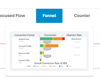
|
|
Counter |
Display a single KPI value or count. 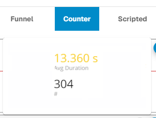
|
|
Scripted |
Display multiple KPI values or counts using configured logic.
|
Available visualization options depend on the KPI and configuration.
➕ Create an Aggregate Dashboard
Go to:
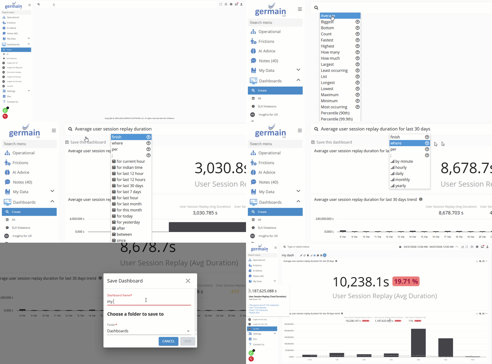
Germain Workspace > Dashboards > Create (An intuitive, key-based UI that dynamically builds a dashboard based on your selected criteria.)
Germain Workspace > Dashboards > All > +
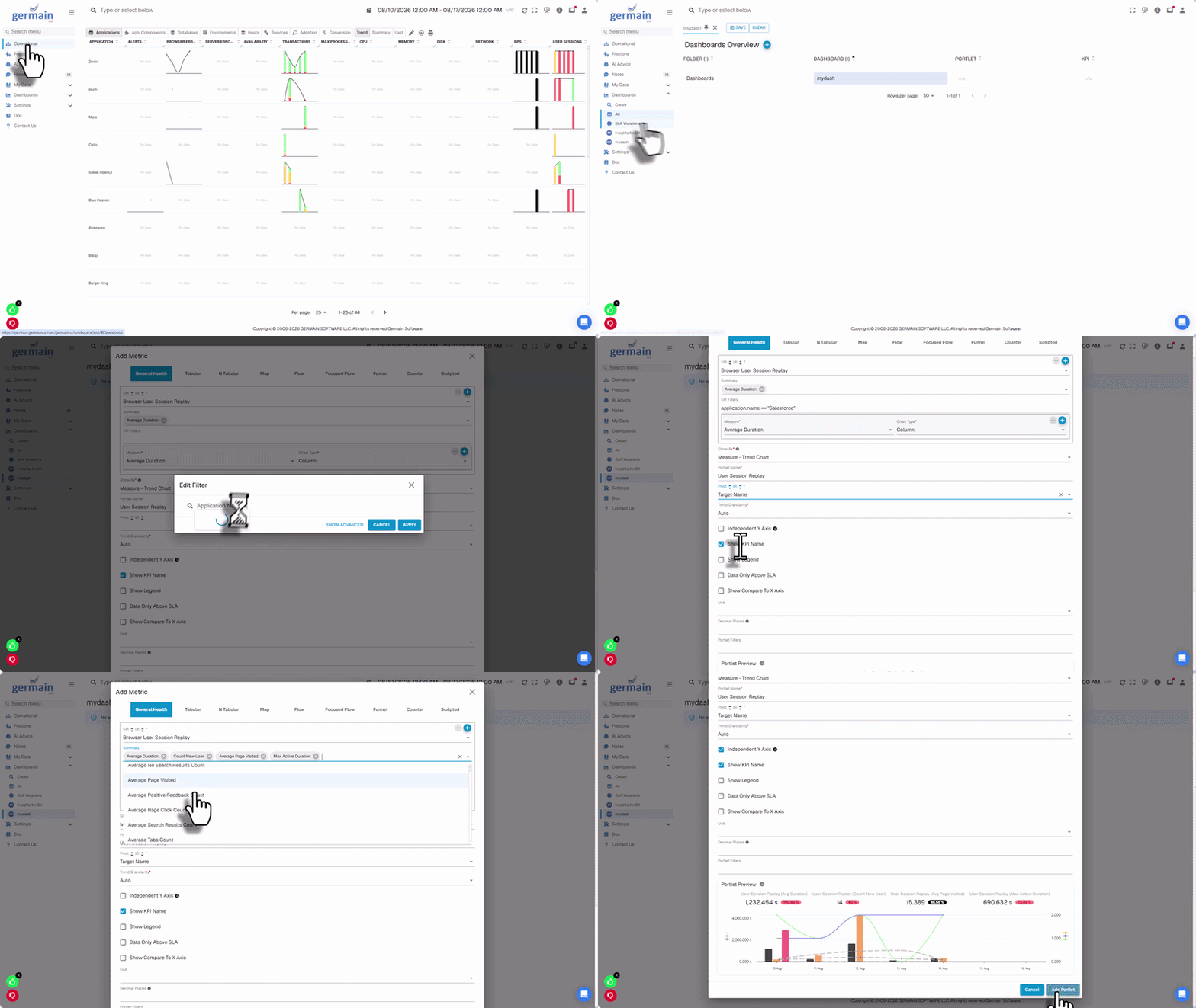
Then:
-
Enter the dashboard name.
-
Select the appropriate folder.
-
Define who can view the dashboard.
-
Define who can manage the dashboard.
-
Add the required KPIs and portlets.
🔎 Filters
Filters can be configured at:
-
Dashboard level — applies to compatible portlets across the dashboard.
-
Portlet level — applies only to the selected visualization.
-
Scripted Portlet level - two filtering options on a scripted portlet:
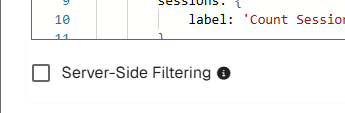
Server-Side Filtering Settings on a Scripted Portlet - GermainUX -
Client-side Filtering (default) - When a portlet uses client-side filtering, the workspace automatically applies the selected filters to the columns configured for that portlet.
If a selected filter is not compatible with the portlet, the portlet displays “No Data.” This behavior is consistent with other GermainUX portlets.
-
Server-side Filtering (required explicit opt-in) - When a portlet is configured for server-side filtering, the data-query script receives the selected filters as a filter string.
The script author determines how to handle this filter. In most cases, the filter string should be passed to the underlying queries so that the data is filtered on the server before being returned to the portlet.
-
Use dashboard-level filters when the same investigation context should apply across the dashboard.
🔒 Permissions
Two primary permissions control dashboard access:
-
View — users or teams can access the dashboard.
-
Manage — users or teams can edit the dashboard.
🔁 Compare To
Use Compare To to compare the selected period with another period.
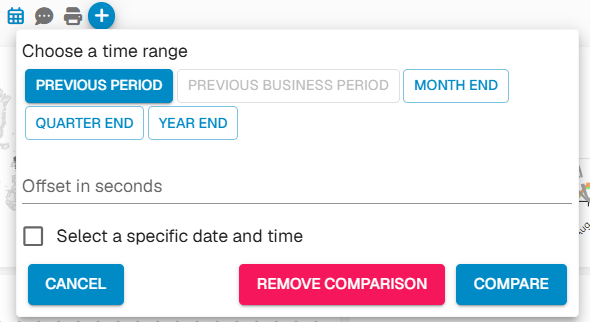
Comparisons can display:
-
Current and comparison trends
-
Absolute difference
-
Percentage change
-
Visual indication of increases and decreases
This can help distinguish a regression from normal variation or seasonality.
📌 Pin a Dashboard
Frequently used dashboards can be pinned to the Workspace menu.
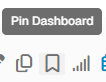
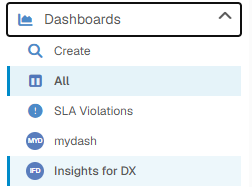
Pinned dashboards can be reordered under:
Workspace Menu > Dashboards
🔍 Focused Flow
Focused Flow analyzes activity across journey milestones to identify friction and abandonment at scale without requiring teams to replay every individual session.
Supported KPI types can include:
-
Shopify Events
-
Story Beats
-
User Clicks
Available options depend on the monitored application and KPI.
🖊️ Add or Edit a Portlet
Select + Add Metric to add a portlet or open an existing portlet's settings to modify it.
Configuration can include:
-
KPI
-
Measure
-
Visualization
-
Pivots
-
Filters and constraints
-
Display name
-
Time range
-
Comparison
-
Drilldown behavior
🚫 Constraints
Constraints permanently restrict the data included in a portlet.
Example:
(user.name == 'jsmith')
Multiple conditions can be combined using supported logical operators.
🧮 Measures & Pivots
Measures determine what is calculated, such as:
-
Count
-
Average duration
-
Lost productivity
-
Conversion rate
Pivots determine how data is segmented, such as:
-
Application
-
Environment
-
Page or screen
-
User
-
Business process
-
Product
-
Device
-
Region
-
Browser or version
⚙️ Manage the Dashboard
Available management actions can include:
-
Edit
-
Clone
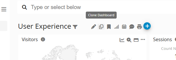
Clone Dashboard - GermainUX -
Print
-
Change trend granularity
-
Create a note or ticket
📁 Preconfigured Dashboards
GermainUX includes preconfigured Aggregate Dashboards. Dashboards created by your organization are available alongside them under:
Germain Workspace > Dashboards > All
Related Documentation
-
Analytics Dashboards
-
Pivot Dashboard
-
Drill-through Dashboard
-
Analysis Dashboard
-
Create & Customize Dashboards
-
Search & Filters
ℹ️ Get Help
The Germain Team can help you set this up. Contact GermainUX Support.
Feature Availability: 2014.1 or later